Two Trout Where precision meets passion. See how we integrated fine-line illustration with architectural drafting marks to create a sophisticated, "dual-nature" brand for one of the industry's most sought-after hotel design consultants.
Billy Holmes
Illustration
Balancing Architectural Precision with Personal Passion: Carl Kernodle is a high-demand architectural consultant specializing in major hotel developments and large-scale architectural projects. His reputation is built on a rare combination of elite technical leadership and a creative, detail-oriented perspective often inspired by his connection to the outdoors.
The Challenge
The "Corporate vs. Creative" Friction: Carl’s existing brand presence didn't reflect the "Dual Nature" of his value proposition. The Brand Mismatch: While he manages massive, technical architectural projects, his clients are drawn to his individual creativity and outdoorsman spirit. The Detail Gap: In architecture, the "magic" is in the details. A generic corporate logo would fail to communicate the meticulous level of oversight Carl provides on multi-million dollar developments. The Legacy Feel: He needed a brand that felt established and authoritative yet distinct from the sea of minimalist, cold architectural firms.
The Strategy
Relational Drafting The strategy centered on William Lidwell’s principle of Layering. We wanted to create a visual identity that rewarded closer inspection—mirroring the way an architect reviews a blueprint. By overlaying organic forms (the trout) with rigid geometric guides (drafting marks), we created a visual metaphor for Carl’s ability to bring creative vision into a technical reality.
Project Scope
Brand Strategy & Personality Profiling
Technical Illustrative Logo Design (Multi-Mark System)
Architectural Drafting Aesthetic Integration
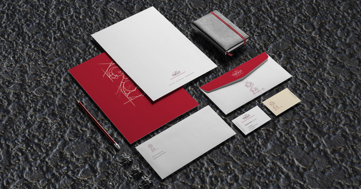
Premium Stationery & Business Documentation Suite
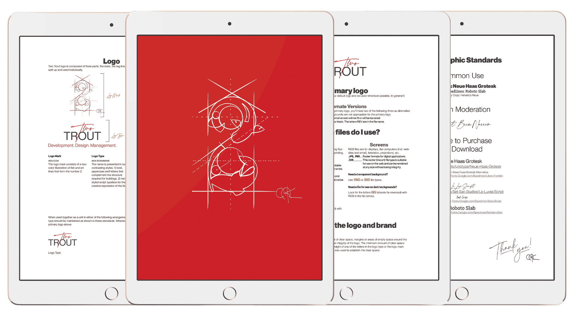
Brand Standards & Usage Governance
The Solution
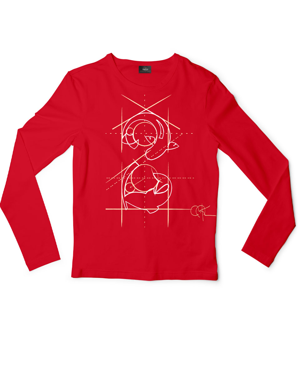
A Multi-Mark Brand System: Collaborating with illustrator Billy Holmes, we developed a sophisticated brand identity that functions as a "technical illustration." The Integrated Mark: The centerpiece is a finely detailed illustration of two trout formed into a subtle "2." To anchor this in the world of architecture, we incorporated drafting marks—intersecting lines and circular arcs from a manual compass—to show the "calculated" placement of the organic forms. The Logo Ecosystem: We created a flexible system of marks, including a full logotype, a standalone illustrative mark, and simplified versions for various scales, ensuring the brand remains legible from a business card to a site plan. The Tactical Suite: We extended the brand into a premium physical experience, designing high-end business cards, thank you cards, and internal business documents that reinforce his attention to detail. The Brand Blueprint: We delivered a comprehensive Brand Personality Profile and Logo Usage Guide, ensuring that as Carl’s consultancy grows, his visual "handshake" remains consistent across all platforms.


The Result
A Brand That Commands the Room: The Two Trout identity has successfully aligned Carl’s personal passions with his professional expertise. It serves as a conversation starter that immediately validates his creativity and technical mastery. By "connecting the dots" between the outdoors and the drafting table, we’ve created a brand that is as unique and high-performing as the architectural projects Carl leads.

