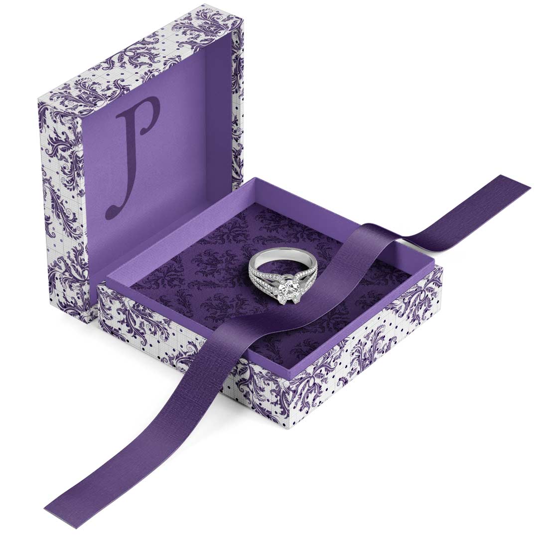
This logo redesign project for high-end jewelry designer Judith Poe was a deeply collaborative and creatively rich experience. Judith approached the project with a clear vision: she wanted a simple, elegant, and timeless typographic logo that reflected the sophistication and artistry of her custom jewelry. Drawing inspiration from iconic jewelers, she also emphasized the importance…


This logo redesign project for high-end jewelry designer Judith Poe was a deeply collaborative and creatively rich experience. Judith approached the project with a clear vision: she wanted a simple, elegant, and timeless typographic logo that reflected the sophistication and artistry of her custom jewelry. Drawing inspiration from iconic jewelers, she also emphasized the importance of her signature purple and the emotional connection she infuses into each piece.
The design process centered on refining her name in classic serif typography, with particular attention to the elegant letterforms of the “J” and “P.” A unique feature—a raised “I” in her name—was introduced to symbolize the personalized, client-focused nature of her work. Though it sparked debate, both designer and client embraced its emotional impact and memorability.
An accompanying icon was developed by intertwining the initials “J” and “P” with equal visual weight, creating a balanced, ownable mark that could be used independently. Two logo versions were finalized—one with the raised “I” (luxe) and one with a level “I” (standard)—to offer flexibility across brand applications.
The final logo aligns seamlessly with Judith Poe’s brand. The result is a refined and distinctive visual identity that reflects Judith’s creativity, sophistication, and devotion to meaningful, one-of-a-kind jewelry design.

