
Accessible Websites: Making your site readable and useable for impaired visitors
Share this article.
Colors: How to use your color palette to enhance your brand while being accessible During the 2019 redesign of this site, accessibility has been a growing concern and focus…as it should be! I create sites for clients, who may or may not know about all the ADA compliance guidelines. It’s now my responsibility to ensure go forward that my clients’ sites are compliant–not just for legal reasons but also to help their brand be more inclusive. Because much of my studies have focused on color and memory, constraints for visual impairment mean a new approach to color for me. The key to color combinations for accessibility is contrast–in light and size. Greater contrast in light means shapes and text are more easily visible and distinguishable. Greater contrast in type (a.k.a. font) size means content hierarchy is more quickly identifiable. There’s a third variable that combines the type size with light contrast for readability. See the chart below with Fat Dog Creative’s five primary brand colors. You’ll notice that some color combinations get a “pass” for large type but “fail” if used for “small” type. This color tool makes it easy to identify the combinations and how to use them to create a very accessible site for most visitors. Use All Five: This site is very easy to use. Just input your color values (opens in new tab). “This tool shows you how ADA compliant your colors are in relation to each other. By adding your brand’s colors on the right, you can generate a chart to see how they can be used together for accessibility, and find similar colors that work better.” ABC Use All Five PDF Downloads Acrobat has a built-in tool to help you evaluate the accessibility of PDFs. Many businesses use PDFs as lead magnets, worksheets, or calendars. Don’t forget to include these in your evaluations! PDF Evaluation Instructions (opens in new tab) Typography and Accessibility Finding a typeface that communicates well “for” your brand but also communications “to” a broader range of your ideal clients with impaired visual processing can be frustrating. However,…: How frustrated might impaired visitors to your site be? What if they are your ideal clients? How likely would an ideal but frustrated visitor become an actual client? We niche for a reason–to be known for one thing or to one group. To exclude qualified, ideal clients simply because of frustration is not helping our brands. Recite Me, an assistive technology company, has created the Accessible Fonts Guide to help eliminate frustration from both you (and your designer) and your potential ideal clients. (opens in new tab) The Dyslexia Font Enables Faster Processing and Comprehension Dyslexia is a visual learning disability. It’s not a marker of intelligence. Zag Interactive addresses Dyslexia (opens in new tab) with some helpful recommendations based on case studies, regulations and other web conformant guidelines. These best practices to help address this population’s needs and frustrations and facilitates greater understanding of your content. Best practices to guide dyslexia-conformant web design and development: Use bullet lists where you can. Use Sans Serif fonts. Break large forms out into multiple logical pages. Do not center justify text. People with dyslexia process language very differently, which frequently manifests as struggling with poor spelling and writing, slow reading, and mispronunciation. Approximately 15–20% of the population has symptoms of dyslexia. A large portion of the population is often unaware they even have it. One of the most recent revolutions in typography, was the development of a typeface (also called a “font”) that helps to correct and clarify visual processing for Dyslexics. “The letters of the Dyslexie font are designed by taking the experience of dyslexia into consideration.” Dyslexie Font, by PingOnline
Colors: How to use your color palette to enhance your brand while being accessible
During the 2019 redesign of this site, accessibility has been a growing concern and focus…as it should be! I create sites for clients, who may or may not know about all the ADA compliance guidelines. It’s now my responsibility to ensure go forward that my clients’ sites are compliant–not just for legal reasons but also to help their brand be more inclusive. Because much of my studies have focused on color and memory, constraints for visual impairment mean a new approach to color for me.
The key to color combinations for accessibility is contrast–in light and size. Greater contrast in light means shapes and text are more easily visible and distinguishable. Greater contrast in type (a.k.a. font) size means content hierarchy is more quickly identifiable. There’s a third variable that combines the type size with light contrast for readability.
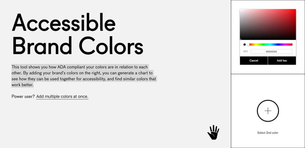
See the chart below with Fat Dog Creative’s five primary brand colors. You’ll notice that some color combinations get a “pass” for large type but “fail” if used for “small” type. This color tool makes it easy to identify the combinations and how to use them to create a very accessible site for most visitors.
Use All Five: This site is very easy to use. Just input your color values (opens in new tab).
“This tool shows you how ADA compliant your colors are in relation to each other. By adding your brand’s colors on the right, you can generate a chart to see how they can be used together for accessibility, and find similar colors that work better.”
ABC Use All Five

PDF Downloads
Acrobat has a built-in tool to help you evaluate the accessibility of PDFs. Many businesses use PDFs as lead magnets, worksheets, or calendars. Don’t forget to include these in your evaluations!
PDF Evaluation Instructions (opens in new tab)
Typography and Accessibility
Finding a typeface that communicates well “for” your brand but also communications “to” a broader range of your ideal clients with impaired visual processing can be frustrating. However,…:
- How frustrated might impaired visitors to your site be?
- What if they are your ideal clients?
- How likely would an ideal but frustrated visitor become an actual client?
We niche for a reason–to be known for one thing or to one group. To exclude qualified, ideal clients simply because of frustration is not helping our brands.
The Dyslexia Font Enables Faster Processing and Comprehension
Dyslexia is a visual learning disability. It’s not a marker of intelligence.
Zag Interactive addresses Dyslexia (opens in new tab) with some helpful recommendations based on case studies, regulations and other web conformant guidelines. These best practices to help address this population’s needs and frustrations and facilitates greater understanding of your content.
Best practices to guide dyslexia-conformant web design and development:
- Use bullet lists where you can.
- Use Sans Serif fonts.
- Break large forms out into multiple logical pages.
- Do not center justify text.
People with dyslexia process language very differently, which frequently manifests as struggling with poor spelling and writing, slow reading, and mispronunciation. Approximately 15–20% of the population has symptoms of dyslexia. A large portion of the population is often unaware they even have it.
One of the most recent revolutions in typography, was the development of a typeface (also called a “font”) that helps to correct and clarify visual processing for Dyslexics.
“The letters of the Dyslexie font are designed by taking the experience of dyslexia into consideration.”
Dyslexie Font, by PingOnline
Sorry, we couldn't find any posts. Please try a different search.