Evolution of a Logo: Compliance Diagnostics
Share this article.
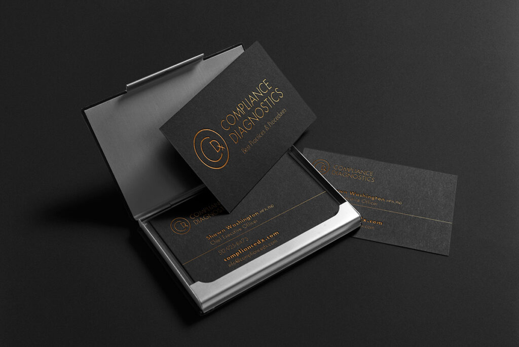
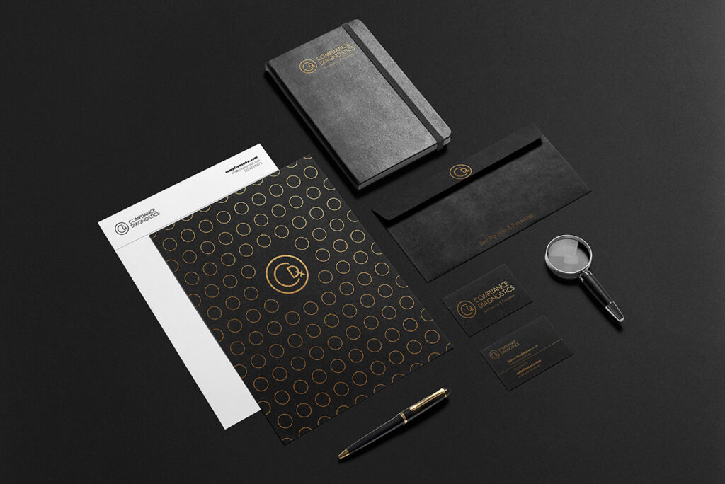
Certain aesthetics are more appealing to certain socio-economic classes. This deceptively simple, monoline design uses a monochromatic color palette to appeal to wealthier clients and the businesses that serve them.
Logo design is my favorite type of design. One has to learn or know the industry, the client, the business, and their target audience. Then, the design must establish that smooth, appealing bridge from one to the other. What is Compliance Diagnostics This business serves financial institutions, which are highly regulated. Regulations mean being diligent about review processes and policies. Because of the ever-changing regulations and employee turnover, broker-dealers, clearing houses, financial firms and other industry supportive businesses must periodically, usually annually, conduct a compliance audit. The audit helps determine if the processes and policies in place for compliance review are effective and meet current regulations. When dealing with this industry, Dr. Shawn Washington’s brand must convey trustworthiness and discretion.
Additionally, a firm hiring her for these services is doing so as a form of proactive protection for any future government or government oversight agency audits. Starting With Brainstorming Because of my familiarity with the medical industry, diagnostics immediately brought a number of references to mind. Dx (shorthand) science analytical thinking methodical scientific method illness, disease health status checkup doctor protection safety ensure/assure The most obvious and least complex, Dx, started the sketching process.
I examined the shapes of the letter forms and wrote out the entire name to examine all the letter forms. From lowercase to uppercase and title case. Curious about how to make sense of using the initials and after manipulating the relationships to each letter form, C and D, I added in the lower case x. I examined the prescription pad concept–different ways to represent paper with the Dx.
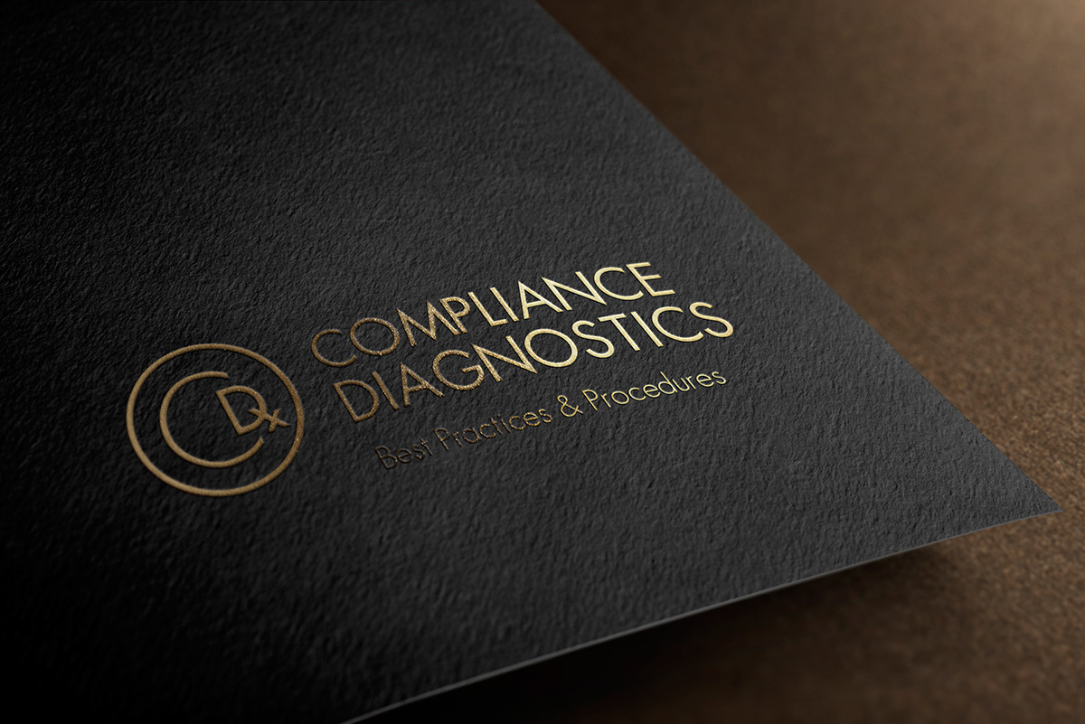
Working to soften the harsh edges of the paper, I used circles to edit those corners. As the “paper” shape became less obvious, the circle enclosing the letters sparked the use of the copyright symbol. Multiple meanings in one symbol This design plays on the protections given by copyrighting, (“a form of intellectual property with rights over reproduction, derivative works, distribution, public performance, and “moral rights” such as attribution”) and the protections one can take with thorough compliance audits and establishing best practices for reviews. Additionally, the Dx is medical shorthand for diagnosis, which means identifying the cause of symptoms. This is also part of the compliance audit–identifying the breakdown in the review process or policies.
Aesthetics
All line weights are equal. This is called a monoline design. Monoline designs are a breath of fresh air amidst the multi-colored and gradient designs today. While it may appear to be complex on first blush, this is a simple, clean, aesthetic with lots of versatility.
With high-end clients, this design is particularly appealing. Monochromatic color palettes have limited contrast. Limited contrast means the design or any elements in the design do not “scream” for attention. When I discuss the appeal of monochromatic palettes to wealthier populations, I share the following adage: Money talks; wealth whispers. This means that when someone “with money” offers cash people notice, move, and accommodate. Conversely, confident, wealthy people, don’t need to show it off or be “seen” at the swankiest places. They do not need to announce their presence in any way. This is the best analogy for the monochromatic palette.
