Evolution of a Logo: Judith Poe Jewelry
Share this article.
Austin, TX jewelry designer, Judith Poe, creates custom high-end jewelry. Judith Poe translates and conveys emotions and concepts in each beautiful piece of jewelry.
This was one of those surprise projects that was fun yet challenging. Judith referenced high-end jewelers she aspired to. She knew she wanted a typographic mark, simple, elegant, and timeless. She had a clear vision of what she liked and the direction she wanted to go. She shared photos of some of her favorite pieces to help me understand her work better. We discussed the significance of her signature color purple and agreed to continue with it.
I’m a typography nerd. This was the kind of project I had been wanting. And, discovering the various needs of logo marks on and around jewelry, I knew she would need some kind of simple, iconic identifier—based entirely in type.
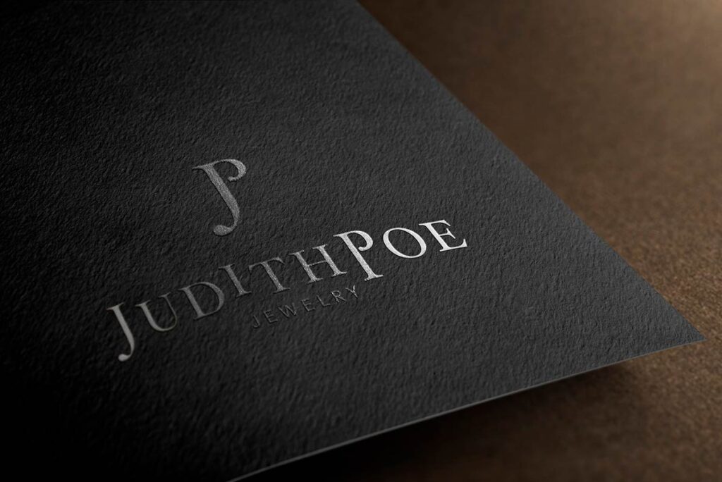
I started the project by writing and typing her name in title caps, all caps, and all lowercase. I examined how the individual letterforms fit next to one another in all versions. With the idea of a timeless mark, I wanted to focus on classic typefaces, particularly serif type. I identified a serif typeface that worked really well for each letter, especially the J and P. The serifs on the capital J and P were elegant, feminine, and smooth.
My next goal was to find a way to emphasize the custom work Judith puts into each piece for her clients. The letter I stood out in her name. I thought, ‘Incorporate the client into the logo’ by breaking the plane with the “I.” It added the personalization I wanted, so I literally made the I look like it was being inserted into her name. Because the letter I is not the center letter, it could look unbalanced, especially if the icon I would create were to be centered over the logo type. I decided the message behind the I breaking the plane was more important than balance.
Once I had the name in type, I started working on the logo mark (icon). Using her initials, I joined and manipulated the letters J and P. The goal and end result was for both letters to have equal visual weight, neither letter would have prominence over the other.
I submitted the designs to Judith. We debated together on keeping or removing the raised I. We decided to tentatively keep it because she too liked it’s message over balance. She announced the logo on her social media accounts and got lots of feedback. All was positive except for the I. There was a lot of controversy over it, which we expected. Like me, Judith realized that the controversy meant it evoked emotion and decided to keep it. After all, the controversy helped make it even more memorable. However, we used two versions, one with the I above the horizon (luxe) and one level (standard). She especially loved and appreciated the icon made from her initials.
Judith Poe Jewelry
You’ve now heard the story about how the logo evolved from just three words and the color purple into an elegant, unique logo. Now, get to know Judith’s work and see how the logo complements it. (And, see more of the lovely product work from Life in an Image based in Austin, TX of Judith Poe Jewelry.)
You can find Judith Poe Jewelry in these fine boutiques.
Austin
San Francisco
- ASMBLY HALL
- In-House
- The Last Straw
- Les Mechantes
- Gitane Style
Judith Poe specializes in custom high-end jewelry design. Translating and conveying an emotion or concept in a beautiful piece of jewelry is Judith’s talent.
Experience the Jewelry in Photographs
To showcase her work, Judith enlisted Neil Gandhi, Life in an Image, to photograph her jewelry. Again, Judith has always known her own brand, even before the brand stamp (logo) was created. Her choice of photographers is spot on! Neil’s style is a great match for Judith’s designs.
