Evolution of a Logo: LiVegan
Share this article.
Mona Chmeis had an idea. Because she's vegan and respects the life of any living, breathing animal, she noticed a gap in the vegan clothing marketing. Mona created LiVegan to provide a safe apparel shopping experience for vegans.
Every brand begins with a belief.
For Mona Chmeis, that belief was simple: no animal should suffer for fashion. As a vegan and athlete, she saw a glaring absence in the market—clothing that reflected her values without compromise. Not just vegan in philosophy, but in material, message, and intent. And so, LiVegan was born: an athletic-wear brand designed for people who move with purpose.
But intention without clarity can fall short. The original logo Mona created had the right instincts—but lacked the execution to match the brand’s potential. That’s where the redesign began.
Original Logo

Clarity Before Cleverness
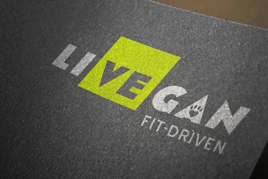
At the heart of the original concept was a smart idea: the letters V and E in the word “LiVegan” performed double duty, subtly connecting the words “Live” and “Vegan.” This wasn’t just a typographic trick—it was a philosophical position. Life is a choice, and Mona was making hers visible. That choice was worth preserving.
But good design doesn’t stop at a clever symbol. It’s about cohesion. About story. About utility.
Color as Meaning
Color tells a story before words do. The original logo used pink—a hue too close to red, and by extension, too close to blood. For a cruelty-free brand, that emotional dissonance mattered. We replaced it with neon green, brushing the edge of yellow to reflect energy, light, and vegetation—the very essence of plant-based living. Paired with urban gray, it balanced femininity with grit, sunlight with concrete. This wasn’t a pastel palette; it was a manifesto.
Structure in Motion
The original logo leaned heavily on block shapes—strong, but static. For clothing made to move, that rigidity sent the wrong signal. Instead of discarding the geometry altogether, we repositioned it. We introduced forward motion by slanting the design rightward—a universal symbol for progress, momentum, and purpose. We honored the original grid but evolved it into something dynamic.
Precision over Stereotype
The typography needed to change. The original font, a stencil reminiscent of military surplus, lacked nuance. It was too masculine, too dated, and didn’t reflect the precision or agility of the brand’s audience. We selected a typeface with clean, sharp lines—modern, legible, and slightly feminine, but strong. Because strength doesn’t need to shout.
A Paw with Purpose
The paw mark from the original design remained—refined, repositioned, and recontextualized. It’s not ornamental. It’s symbolic. It reminds the wearer who this brand is truly for: those without a voice.
In the end, LiVegan’s new identity isn’t just more functional or more attractive. It’s more true. It reflects motion, compassion, and clarity. It balances values with performance. And like any great brand, it doesn’t just show what the company does—it shows what the company believes.
Because when design and belief align, brands don’t just look better.
They become better.
Redesigned Logo

