Evolution of a Logo: Mozak Design
Share this article.
In November I finally met Jocelyn Mozak in person after connecting with her on social media a few months earlier. We were both speaking at WordCamp Seattle. Little did I know when I first met her that we were speaking on the same topic. When I realized it, I was concerned. ‘Oh, no! People might just pick one and not the other, and they’ll probably pick hers!’ You know, it was all that negative self-talk. We were both speaking on streamlining for more productivity. I attended her session after finishing my own. Wow! I seriously don’t think we could have planned a better “program”. My presentation focused on how to get organized with repetitive tasks and tools to consider using once you’ve got all of your templates created. (Increase Your Productivity in Big & Small Ways) Segue to Jocelyn’s presentation (Clone Yourself Through Automation), which was ideal for those ready for that next step—automation. What she was doing was impressive! Her automated process for on-boarding, project updates, and nurturing after the fact was pure efficiency! Her energy and enthusiasm were contagious. (I think we should take our shows on the road together one day.) The Motivational Speaker My favorite quote from her presentation had nothing to do with productivity but everything to with growth. She was a motivational speaker even while discussing automation! “I’m a work in progress, this is the polish I have to date.” “I’m a work in progress, this is the polish I have to date.” Absolutely ❤️❤️❤️ this from Freelancer turned Ageny Owner @JocelynMozak #WCSEA @WAConvention @fatdogcreatives pic.twitter.com/LX953SUktX — Kim Thornton (@KimCThornton) November 12, 2018 She shared a bit about her journey with breast cancer and how automated tasks and her team meant that her business continued, even while she was sick with chemo. Who wouldn’t want that? We all get sick—acute or chronic illness—or deal with family members who do. To see her on stage, knowing what she had experienced, and how she overcame it was inspiring! The Logical Tech Jocelyn is by education an engineer and currently works as a website developer, which explains how she was able to hone in on and refine her processes so quickly and efficiently. Five years, she made the switch from freelancer/solo-entrepreneur to an agency allowing her to focus more on the technical/development than the aspects of design and marketing. She knows code. She can write and edit. She’s quick and detail-oriented, a typical engineer. The Missing Pieces The experiences with and impressions of Jocelyn are important to note because it influenced the design we created together. She is also not a typical engineer. She’s got a level of social interaction you don’t typically see from this group of professionals, and she’s very compassionate and creative. Her logo had been untouched since its creation 10 years ago. Overall, it was a fine logo had I not experienced her in person and already had a vision of where she could go. It focused on the technical aspect of her work—ignoring all the design aspects. It showed the Power of her knowledge—ignoring the heart. It was a bit dated—ignoring her depth of knowledge on current trends in design, code, and tools. It was flat—not reflective of the dynamics of experiencing her. The color palette needed more depth, or contrast. (denim & blue only) It needed accent colors and a bit of warmth add. Jocelyn wrote me saying, “I’ve decided to gift myself this rebrand.” What a flattering statement! I was excited because I knew what I had experienced with her during and since WordCamp was special. (More on how we addressed this in an upcoming post.) The Rebrand Process Before approaching the mark and typography, we had a virtual meeting to review her key brand words. Culture: What qualities embody your business culture? Dependable Customers: What qualities do your ideal customers possess? Relationship-based/emotionally open Voice: How do you and your business sound to others? High integrity Feeling: How do customers and potential customers feel after interacting with you and your business? Heard Impact: What is the real impact you and your business have on your customers? Confidence in their brand IT Factor: What makes you and your business different from others in the same service/industry? Coaching Additionally, I had to remember who Jocelyn targets; women coaches, speakers, and wellness professionals. I use these words to filter everything I design. Does the complete color palette honor these words? Does the typography assist in communicating these values, visions, and traits? Does the mark honor these words? Color Her signature tone of blue (denim) was overused on the website. To highlight that it’s her signature color meant it needed to be treated differently—like something special. I started with choosing a color palette for the logo itself using the two blues she was already using and adding a third, darker blue (indigo) and brighter blue (aqua) to create more contrast. To expand the brand’s palette, I added yellow for accents, fuchsia for more obvious feminine touch, a brown for warmth, cream, and aquamarine. Typography Once the color palette was more feminine with some warmth, the typography was addressed. I chose a modern, clean, sans-serif typeface (Futura) with both rounded curves to connect with more feminine aspects (relationships, emotion, and integrity) and sharp intersecting lines (reliability, confidence, and dependability). Logo Mark I wanted to see if I could retain some elements from her original logo…
In November I finally met Jocelyn Mozak in person after connecting with her on social media a few months earlier. We were both speaking at WordCamp Seattle. Little did I know when I first met her that we were speaking on the same topic. When I realized it, I was concerned. ‘Oh, no! People might just pick one and not the other, and they’ll probably pick hers!’ You know, it was all that negative self-talk. We were both speaking on streamlining for more productivity.
I attended her session after finishing my own. Wow! I seriously don’t think we could have planned a better “program”. My presentation focused on how to get organized with repetitive tasks and tools to consider using once you’ve got all of your templates created. (Increase Your Productivity in Big & Small Ways) Segue to Jocelyn’s presentation (Clone Yourself Through Automation), which was ideal for those ready for that next step—automation. What she was doing was impressive! Her automated process for on-boarding, project updates, and nurturing after the fact was pure efficiency! Her energy and enthusiasm were contagious. (I think we should take our shows on the road together one day.)
The Motivational Speaker
My favorite quote from her presentation had nothing to do with productivity but everything to with growth. She was a motivational speaker even while discussing automation!
“I’m a work in progress, this is the polish I have to date.”
“I’m a work in progress, this is the polish I have to date.” Absolutely ❤️❤️❤️ this from Freelancer turned Ageny Owner @JocelynMozak #WCSEA @WAConvention @fatdogcreatives pic.twitter.com/LX953SUktX
— Kim Thornton (@KimCThornton) November 12, 2018
She shared a bit about her journey with breast cancer and how automated tasks and her team meant that her business continued, even while she was sick with chemo. Who wouldn’t want that? We all get sick—acute or chronic illness—or deal with family members who do. To see her on stage, knowing what she had experienced, and how she overcame it was inspiring!
The Logical Tech
Jocelyn is by education an engineer and currently works as a website developer, which explains how she was able to hone in on and refine her processes so quickly and efficiently. Five years, she made the switch from freelancer/solo-entrepreneur to an agency allowing her to focus more on the technical/development than the aspects of design and marketing.
She knows code. She can write and edit. She’s quick and detail-oriented, a typical engineer.
The Missing Pieces
The experiences with and impressions of Jocelyn are important to note because it influenced the design we created together. She is also not a typical engineer. She’s got a level of social interaction you don’t typically see from this group of professionals, and she’s very compassionate and creative.
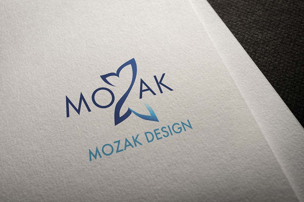
Her logo had been untouched since its creation 10 years ago. Overall, it was a fine logo had I not experienced her in person and already had a vision of where she could go.
- It focused on the technical aspect of her work—ignoring all the design aspects.
- It showed the Power of her knowledge—ignoring the heart.
- It was a bit dated—ignoring her depth of knowledge on current trends in design, code, and tools.
- It was flat—not reflective of the dynamics of experiencing her.
- The color palette needed more depth, or contrast. (denim & blue only)
- It needed accent colors and a bit of warmth add.
Jocelyn wrote me saying, “I’ve decided to gift myself this rebrand.” What a flattering statement! I was excited because I knew what I had experienced with her during and since WordCamp was special. (More on how we addressed this in an upcoming post.)
The Rebrand Process
Before approaching the mark and typography, we had a virtual meeting to review her key brand words.
- Culture: What qualities embody your business culture?
- Dependable
- Customers: What qualities do your ideal customers possess?
- Relationship-based/emotionally open
- Voice: How do you and your business sound to others?
- High integrity
- Feeling: How do customers and potential customers feel after interacting with you and your business?
- Heard
- Impact: What is the real impact you and your business have on your customers?
- Confidence in their brand
- IT Factor: What makes you and your business different from others in the same service/industry?
- Coaching
Additionally, I had to remember who Jocelyn targets; women coaches, speakers, and wellness professionals.
I use these words to filter everything I design.
- Does the complete color palette honor these words?
- Does the typography assist in communicating these values, visions, and traits?
- Does the mark honor these words?
Color
Her signature tone of blue (denim) was overused on the website. To highlight that it’s her signature color meant it needed to be treated differently—like something special. I started with choosing a color palette for the logo itself using the two blues she was already using and adding a third, darker blue (indigo) and brighter blue (aqua) to create more contrast.
To expand the brand’s palette, I added yellow for accents, fuchsia for more obvious feminine touch, a brown for warmth, cream, and aquamarine.
Typography
Once the color palette was more feminine with some warmth, the typography was addressed. I chose a modern, clean, sans-serif typeface (Futura) with both rounded curves to connect with more feminine aspects (relationships, emotion, and integrity) and sharp intersecting lines (reliability, confidence, and dependability).
Logo Mark
I wanted to see if I could retain some elements from her original logo to perhaps serve as a bridge from the previous to the new logo and look. Knowing her journey as a cancer victor, growth of her business from solo-preneur to agency, and her budding speaking and coaching career, I explored concepts that would convey her metamorphosis, enthusiasm, and overall beauty as a human and professional woman, as well as the transformation her clients experience while working with her.
A butterfly was an obvious choice. I explored the less obvious, none of which equalled the beauty of the butterflies wings. Therefore, I took a chance and worked with it, manipulating the shape until it fit naturally into the place of the Z, like the sword slash in the previous logo. Having the wings break the planes of the baseline and cap height helped to emphasize break-throughs for new/renewed confidence and integrity, as well as freedom soar to new heights of personal and professional growth.
The New Logo Design
I had proposed the idea of dropping the word design at some point since it doesn’t speak to all that her “agency” provides. As a professional embracing her new vision and brand, she decided to drop it immediately from the logo.
More to Come
The rebrand began with these elements as they lay the foundation for everything. Being the planner she is, Jocelyn was not sure where this new logo and color palette could take her site, which is the majority of her visual communications and marketing.
You’ll see more collaborations soon with Jocelyn for her businesses, like:
- Website redesign
- eBook redesign
- Sub-brand logo design
- Sub-brand website design
You’ll love what we create together! I know I do!
Is your brand communicating the real essence of you and your ideal clients’ needs?
A rebrand might be in order. The way you start is to make sure you know who you’re talking to. Is it who you intend to target, or are you getting a lot of the “wrong” type of clients?
Use this document to create a profile or story about your ideal client. From basic demographics to psychological triggers, the more you know the more effective your branding and marketing is/will be.
