
Green Geeks Webinar: 7 Must-Have Elements to Make Your Website Amazing
Share this article.
Green Geeks is a great alternative to traditional hosting, and I hope they continue to grow because the internet shouldn't suck up so much of the other resources.
Aka: How to not be the cat. Make your website the dog every visitor wants to greet.
We will cover seven elements that will amaze and delight your potential clients and grow your business. The simple fact is that it doesn’t matter how good you are with what you offer that leads to success. The “winners” are those who know how to reach and connect with their clients. We’ll cover some elements you may not know you’re missing!
In this webinar, we’ll cover seven of the most important features to address on your website to draw attention, maintain interest, and cultivate relationships that could lead to sales.
Our Goals:
- Make a good first impression
- Cultivate connection
- Generate leads
If you do what you’ve always done, you’ll get what you’ve always gotten.
— Tony Robbins
If we’re frustrated, then whatever it is we HAVE been doing; it’s not working.
Let’s restart and set our Websites up for success. Many of these tips might be reminders–reminder of something to-do or that you’ve started but not yet finished.
7 questions we need to ask and answer:
- Do visitors know what problems you solve for them?
- Do visitors know what to do, like the next steps to move forward with you?
- Are you providing value?
- Can visitors easily scroll through your site?
- What’s your website’s social media experience?
- Am I sharing success stories to build trust?
- Am I consistent with my message and how I share it?
1. Do visitors know what problems we solve for them?
- Clear Headline: No one cares about what we sell.
Kind of odd to think we are in business to sell things no one wants. It’s not the things but what the things do or allow that matter.
Our clients just want to know that we understand their frustrations, maybe we’ve even been there and done that, and have a solution for relief. We need to clearly show that we can solve their problems. Maybe we can even list our clients’ frustrations in some way? The key here is to understand what the end result of using our product or service is.
The dreaded S-word, selling, is the difference-maker. Not many people love sales, and no one wants to be sold to. Sales brings up a lot of icky feelings for many of us. Yet, it’s the lifeblood of our business. All too often, it’s not the one who’s got the best product or has the best skills who wins–it’s the one who can make sales.
This is why we have to be upfront and clear at the top of our website before the scroll, which is the updated version of “above the fold” from printed newspaper days.
Pain–Dream–Fix Copywriting Method
We have to sell them on OUR solution to THEIR problem. Do you know how to clearly write out your customers’ problems? Do you truly understand their struggles? What keeps them awake at night? Do they know what their choices are? Can you list their frustrations in some way.
The Pain-Dream-Fix Method works like this:
- List the pains.
- Share the dream of what life would be like without that pain (life after the problem/pain goes away).
- Present the fix, which is your solution.
Putting it simply, people care about easing their pains, saving time, saving money, making more money, etc. If our service saves them time and frustration so they can use that time to spend with money-making tasks, they’re likely gonna want it. But, we have to be clear that’s what we provide–not the actual service, like the website I might build for a client for example.
What is it you’re trying to sell–what are you actually selling? What’s the real problem? You can answer these questions by doing an empathy map; (watch this episode from WP Watercolor on empathy maps and how to use them); then, you use the Pain-Fix-Dream.
If the Pain Dream Fix method isn’t working for you, but if you still want to DIY it, you might want to grab a copy of the Story Brand by Donals Miller; it’s a good starting point.
If you don’t want to DIY your content, I don’t blame you. I wrote my website content for years. I still do. But, I’ve also hired writers who understand this and how to write for the web to rewrite it–take my words, make them make more sense with fewer words while retaining the essence of my style. Todd Jones of Copyflight, Bridget Willard, Warren Laine-Naida, and Todd at Tradecraft Writing are just a few copywriters I know for when you’re in the market for that. The thing is that we have to understand what we need to accomplish with our writing before we hire them so we can get the best bang for our buck. They’ll provide much better results the more we are prepared. It’s the same with anything else. We need to have an idea of what we want in a home before we start discussions with a builder. Maybe we should make sure our land can even support a home.
An Example of a Clear Headline
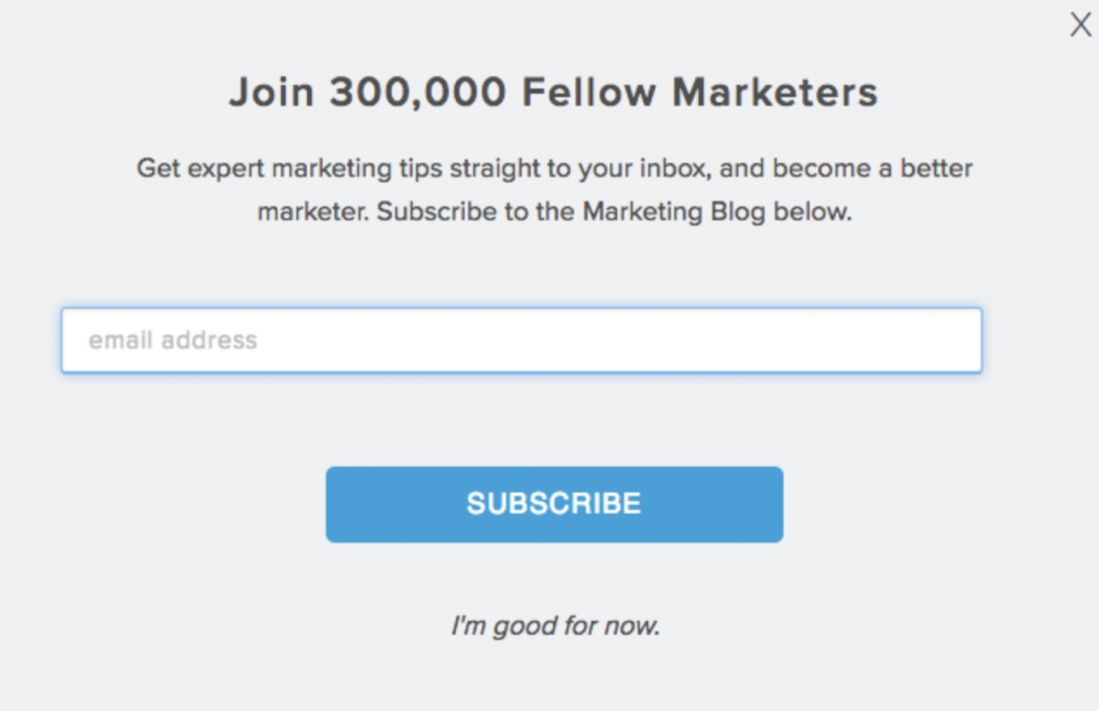
Green Geeks wants to be eco-friendly and wants their customers who are passionate about the environment to know that they’re choosing a host that aligns with their own passions or goals. This is how they are differentiating themselves among many other equally fast and secure hosting companies and a reason why we might choose them over their competitors. They are clear with what they solve for their customers and how. For anyone in the eco-tourism industry this hosting service is the ideal fit.
2. Do visitors know what to do, like the next steps to move forward with us?
- Call to Action: Our site visitors need to know what we want them to do next.
If we don’t tell our site visitors what to do next, they won’t know what to do at all. That means they will probably leave and find someone else who makes their client journey easy and obvious.
Don’t overthink the call to action. Maybe you want them to schedule a consultation, or to get more info, like your pricing documents. We need to be direct, just as we are with the headline, on what the next step should be. As Donald Miller says, “If you confuse, you lose.” That’s so true. If we aren’t clear about what to do next, they can’t do that next step.
We literally want our site visitors to take an action, so we have to call them to act. It also needs to stand out on our pages visually. Green Geeks has a green button in the hero section (aka before the scroll, aka above the fold) that reads, “Get Started Now”. It’s very clearly worded and very obvious visually. We have no doubt what they want us to do next.
3. Are you providing value?
- Lead Magnet: Give them value.
A lead magnet has a call to action. But, it requires some thought and setup, which is why it gets its very own number, #3.
First, some of you are wondering, “What is a Lead Magnet?” Lead magnets are a smart approach to lead generation. Also known as the “bribe-to-subscribe” offer, a lead magnet is a way to get visitors’ information in exchange for something of value.
We can offer anything that can be delivered immediately by email or a link. If the lead magnet is appealing, visitors will subscribe, and we will earn leads. Whatever it is, it needs to provide real value and be relevant. – the days when people simply signed up to receive an email from us are over, but people still want helpful activities and resources that get them closer to solving their problems.
Lead magnets continue the conversation we start with our site’s visitors after they leave.
Why use a lead magnet?
- Generate quality leads
- Provide value
- Get engagement
- They’re shareable.
- Promote your brand as an authority
Here’s a quick summary from the podcast of types of lead magnets:
- A Cheat Sheet or Checklist
- A series of pages that offers steps, examples, and lots of imagery to help illustrate a strategy.
- Easy to skim
- Easy win! Make sure it’s easy for them to finish it.
- You want to go for those quick wins inside of your lead magnet.
- Make it full of valuable info.
- A series of pages that offers steps, examples, and lots of imagery to help illustrate a strategy.
- The Workbook
- Provide information with actionable steps for your potential clients to take time to get ideas out of their head and onto paper, which makes them more likely to get the results they are looking for. There is a lot of perceived value in a workbook. You’re not only sharing your content but you’re making it applicable and actionable.
- It’s a great opportunity to share resources, like affiliate links.
- The Workbook is more of an investment of your time and efforts for your potential customer–no quick wins with this one.
- A Guide
- A guide is more of a narrative where you can lead your potential customers through a story and then stack the value throughout.
- It’s meatier than the cheat sheet and workbook, which means it takes more time for you and your potential clients to get through it.
- Video Training or Audio Training Freebie
- Opportunity to hear or see pieces of your content
- 15 or 20-minutes
- Brings you closer to your potential customer with a deeper connection to them.
- You really also get to see the person’s personality and their teaching style and what they are all about. You don’t always get that from a PDF, a guide, a workbook, a cheat sheet, or a checklist.
- Higher perceived value with audio or video.
- A Challenge
- Have your audience to do something every day for 7-10 days
- The challenge needs to get your audience to do something that changes how they think, how they feel, or gets some results in their business or life. There’s an end-game: How do you want that person to be at the end of the challenge?
- A Quiz
- You learn a lot about your audience.
- Your audience will learn about themselves.
- Quizzes take time and are complex to create and to set up.
- Be very mindful of the questions you’re asking and then the results that you’re creating from those questions.
- With the results you need to give them marching orders/action items.
- A Free Course
- You want your audience to walk away thinking, “That was so good; I would have paid for it.”
- Your audience gets a glimpse of
- How you teach, your knowledge, and your skill set
- What they might pay for down the road.
- This one is definitely going to take more time and effort.
When it comes to lead magnets, Amy Porterfield knows. She’s grown her online business exponentially in a decade’s time. Definitely check out her podcast!
Lead Magnets & Email Marketing
The most common lead magnet is also the most common mistake.
Guess what–no one cares about our newsletters. Generally speaking, they don’t care about “staying up-to-date” or the “getting the latest news on …”.
SEM Rush has great examples of lead magnets and how-tos, including this one on what NOT to do. (Of course, when it comes to SEM Rush, I think we all want every single thing they can send us and will sign up with a call to action like the one above–they’re just that good.)Just asking our visitors to type their email in to become a subscriber doesn’t produce engagement. When was the last time you were persuaded to subscribe just to get newsletters?
This is why it’s smart to offer something of value in exchange for their engagement, such as a free guide or service.
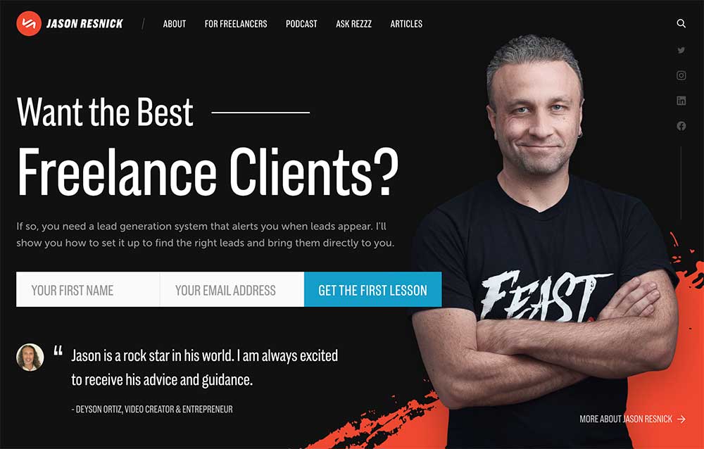
With this one above, Jason Resnik offers a free course over a series of five emails. By my actions he knows I’m interested in getting better qualified clients, which means he’s practicing what he preaches.
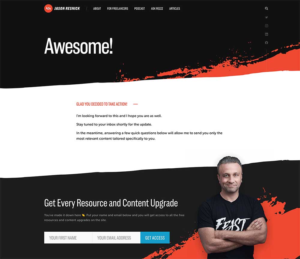
After completing it, I’m redirected to this page (above), which includes more next steps. Give it a try if you like!
Lead Magnets & Email Marketing
Since lead magnets continue the conversation we start with our site’s visitors after they leave, we continue that conversation in their inbox. We do that with what are called list managers or email marketing platforms.
I know, it’s yet another thing to learn and integrate into your setup. It can be complicated but doesn’t have to be. Basically, we just need a form we can put on our homepage or landing page that collects visitors’ email addresses at a minimum, then either sends them to a file or page directly; a page to download, watch, or listen; or emails info or a download to them.
Here’s the good news:
- Most platforms have code for their forms that you can copy and paste into the section of your website where you want it.
- The code means you don’t have to do any kind of fancy integration if you don’t want.
- It also means you might be able to customize the fonts, colors, sizes, etc.
Amy Hall dot Biz is my go-to for MailChimp help.
MailChimp, Mailer Lite, Convert Kit, Constant Contact, or use a tool that is setup and managed within your WordPress dashboard, like Groundhogg.

4. Can visitors easily scroll through your site?
- Mobile-Friendly: Responsive
Here are a few stats to understand why mobile design is so important:
- From March – April of 2022, 58.03% of traffic was mobile worldwide (Source: statcounter)
- Mobile vs desktop usage stats reveal 50% B2B inquiries were made on mobile in 2020. (Source: Smart Insights)
- 65% of all digital media time is spent on mobile devices. (Source: Business2Community)
There are lots of resources to help you test how your website looks on multiple devices with free and paid versions. My favorites are:
- Lambda Test, Best Responsive Checker
- View Port Testing On Local Machine
- Responsive Behaviour Checker
- Side by Side View Port Comparison
- Test on latest desktop and mobile browsers
- Geo Location Testing anytime anywhere
- Automated Web Testing
- Screenfly, Test Your Website at Different Resolutions
- Blue Tree is no longer hosting and supporting the Screenfly application because of staff cutbacks post COV19 and increased server costs. If you’re interested in hosting and running Screenfly, please contact them for information or licensing.
Usability: Easy to Use
Think about how many steps site visitors have to take to achieve something you want them to do. If you’re a restaurant, you probably want customer and potential customers to quickly and easily browser your menu. There are a multitude of ways your potential restaurant customers may use and share the menu.
We have to keep in mind:
- Can our users copy and paste text easily?
- Are we helping or hurting those with visual impairments, including those who use a screen reader?
Often, one family member will offer to pick up food for the family. Everyone wants something different. It’s often easier to go to the website, find the menu item, and copy and paste into a text message. If the menu is an image, that’s not an option. If it’s a PDF, it becomes a frustrating option. If the menu is text on a page, it’s easy!
Imagine friends coming from their homes to another friend’s home to watch a game or Netflix together, and everyone is hungry. “I’ll stop and get some food to-go. Y’all text me what you want?”
The curly haired friend wants the all-vegan burger with a list of condiments you’ve never heard of. The tall, lanky friend wants the deep-friend, spicy parm-crusted chicken with several different dipping sauces. Plus, you’ve got three others with specific orders.
How do they share their orders with you by text message?
Maybe you ask them to each text their orders so you can go through each on at the counter. Sure, they can take screenshots and share that, which means they’ll hopefully have zoomed in and crop only what they want and edit the photo to underline what options they want. That’s one way.
The easiest way might be to select, copy, and paste the item info into a text message to you. That’s easy to do on a laptop or computer if it’s text or a PDF that retains text editing. That’s a little known issue for those outside of the text and design world. There are ways to make images that do and do not retain text editing, so it depends on how the PDF is made. It’s very difficult if not impossible to select text on a mobile device, even when text editing is retained when the PDF was created.
PDF restaurant menus are frustrating on mobile devices because they are typically not designed for mobile screen sizes. They’re typically standard letter size (8.5”x11” the US) or legal size (8.5”x14” in the US). This means users will be sliding, and pinching in and pinching out all over the screen to browse the menu. It’s not like it doesn’t work. But, is it easy? Is it the easiest way for your users to browse the menu on their phones or tablets?
Images of menus have a number of issues, including but not limited to:
- Often too fuzzy to read when zooming in
- Cannot copy/paste text from an image
- Screenreaders cannot read images, which is an issue for those with visual impairments or using them for other reasons.
Images of restaurant menus are so problematic! Not only can your users not copy and paste, but the image also pixelates the more users zoom in. Text on images aren’t good for accessibility either, so that’s all we need to know to never use text on images for menus.
There are ways to enable and assist screen reading by adding alt tags and other information behind the scenes, but that means missing out on the easiest option available to your customers–using text for items names, descriptions, and prices.
Having menus in text on your website is the most effective for a number of reasons.
Carnitas Lonja in San Antonio’s menu on their website is an example of a menu done well and with their customers in mind. No matter what device we are on, we can quickly and easily find, select, copy, and paste all the things we want and don’t want with our order. It’s a bonus for us too that they include photos of each menu item. (Let’s take a moment to thank them either silently, out loud, or by placing our own order.)
Handling QR codes
Thanks to COVID-19, the QR Code has been revived. QR Codes are so convenient! But, not everyone trusts them. We never know where they’ll take us or what will be put on our phones or giving access to something we don’t want shared. We can and probably should still use a QR code, but we need to be upfront and clear on what where it will lead and why. Be sure to put that info near the QR code graphic. Ideally, for accessibility we should be sure to link to a webpage with text.
5. What’s your website’s social media experience?
- Setup for Social: Optimize the display on social media platforms.
- Are you getting attention on social media?
- Are you cultivating relationships?
- What’s your website’s social media experience?
Business-wise, social media platforms are for targeted marketing more than broad advertising. Socially, you can network with friends, classmates, and colleagues–keeping yourself and them top of mind–and maintain those relationships. We want to make sure that whatever way we are sharing, posting, or commenting that we are getting the most bang for our time and maybe our buck if we spend anything.
How Your Website Setup Feeds Social Media
So, we have to make sure the setup is done right and optimized for the greatest likelihood of success, which is grabbing the attention of those scrolling first.
- Images that appear in your post when you are sharing a link from a page on your website
- Page or Post title that shows up when your link is shared (Meta Title)
- Descriptive text that shows up in your shared link
- How this helps with your search results
5 (a). Easy to Use in Social Settings (See also item 4.)
There are many ways to share content other than social media and clicking share or posting our links on social media. Sometimes, people will screenshot a page and text it to someone else, or text the link to a page, or lean over to their friend and show them, or they’ll want to copy and paste specific text into their own notes or calendars. We have to keep these behaviors in mind.
This is also why having text on an image is a bad idea. It’s an accessibility issue for those with visual impairments. Consider all users–who would have to retype everything that’s typed on that image–whether it’s for their own calendar notes or to share someone. We all should have that same text from the image placed above, below, or next to the image to make it easier to copy and paste.
When it comes to accessibility, there are also standards for font sizes. The standard is 14pt or greater for website body copy. My site uses 16 pt for body copy. If yours is less than 14 or 14 but not black close to 80% black, it may not have enough contrast….
Is our site easy to understand?
Make sure there’s a clear distinction between sections of content using appropriate headings and subheadings throughout the page(s). Are we using hierarchy text to aid in reading and understanding the content on our sites?
- Headlines
- Subheadings
- Body
5 (b). Website Needs to Include Open Graph Data.
This is where Open Graph is super important and one that Bridget Willard always mentions. This is Facebook’s meta data that controls how your your web pages and posts look when shared. I’m just going to run through this quickly since I know Bridget has lots of resources to learn more.
- Website needs to include open graph data:
- What is it? How your website/links look when shared on social media
- Hard code it
- Use a plugin (WordPress)
- Ask your developer
- Do a quick search for “how to add open graph in ___” whatever your website platform is
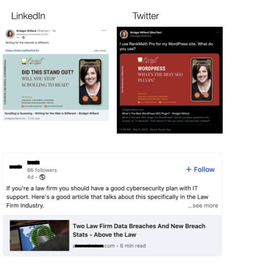
Open graph and in WP plugins that facilitate open graph, like Yoast and SEO Press, setting the Twitter Card to large means you get the larger image, like Bridget’s pictured above, rather than a small image to the left of the linked page title, like the example below Bridget’s posts. Don’t larger images grab your attention quickly and first?
Images that appear in your post when you are sharing a link from a page on your website
- 1200 px by 628 px is standard
- I prefer to use the one that creates the least amount of work but still achieves the goal. I do this for clients who are not using social media. (Why they don’t is another topic entirely.)
- But, as Bridget Willard, the social media marketing expert, will tell you, everything defaults to Facebook–LinkedIn, Twitter, etc.–all default to Facebook. Therefore, I created all of her social media image templates at 1200 px by 628.
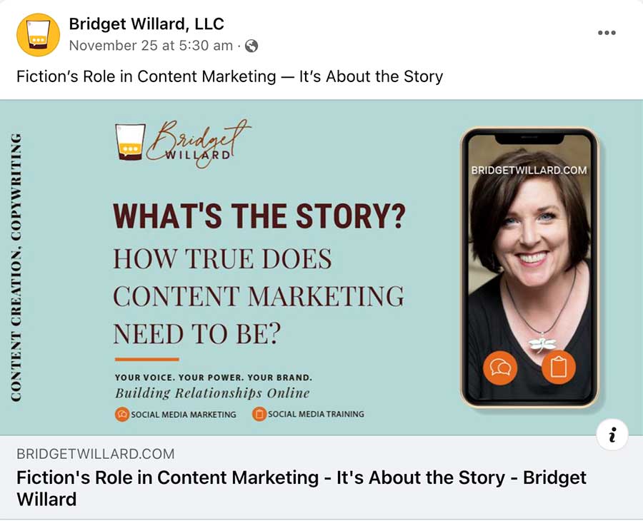

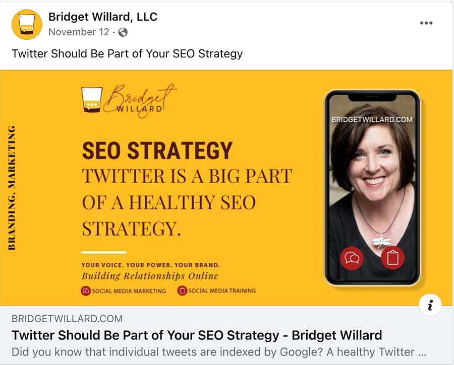
As Bridget Willard, the social media marketing expert, will tell you, everything defaults to Facebook–LinkedIn, Twitter, etc.–all default to Facebook. Therefore, I created all of her social media image templates at 1200 px by 628.
For hers, we kept the same design but assigned roles to colors for different topic categories. This way, her followers will recognize the brand and over time be able to identify the topic category that’s most relevant to them and look for that topic by color.
Page titles & Descriptions
We know that the images grab attention now. We also need to be sure that the page title and description show up with the image too so we can pique interest. Plus, this means we have the page title and description setup properly for search engines.
5 (c). No, Not Networking!
Since we’re talking about social media, that means we’re talking about networking. But, we don’t don’t think about social media the same way we do about networking. There’s a lot more dread for many professionals when they think about networking. We all forget from time to time that social networks are for being social. They connect us. How deeply we are connected with one another is solely dependent on our own efforts. Social networks just facilitate the connection.
There’s a great book by Kelly Hoey called “Build Your Dream Network: Forging Powerful Relationships in a Hyper-Connected World”. In it she talks about “micro networking”. That’s a concept that may sound new to you, but it’s not. It really serves as a reminder on how to be social, personal, and cultivate reliable and beneficial connections. I don’t want to spoil the entire book for you, but I highly recommend it. I listened to it while I drove across Texas one weekend.
Some of the micro networking opportunities she identifies are sending personal emails, physical greeting or note cards, marking birthdays, anniversaries, and keeping track of any other significant information you learn about people you meet, work with, admire, etc. so that they know you listened and value them. When they get that email saying your so excited for them with a screenshot from an article they’re quoted in, they’ll feel appreciated. When they check their mail and see a physical card from you, their appreciation grows.
Again, I don’t want to spoil the book, so I’ll end with this. Make it easy for you to do these things.
- Always have a stack of notecards, envelopes, greeting cards, and stamps in your desk.
- Collect mailing addresses when you can, and alway get email addresses. You can make notes in your phone’s address book to keep track of everything. It doesn’t have to be in an enterprise application that also tracks sales, etc. This is for relationships, not sales. This is to help you grow and learn. Sales will be a byproduct but shouldn’t be the focus.
- When you see or think about something related to someone you know (in-person or virtually), write them a note. It’s that simple.
You know, I don’t share everything on social media these days because I learned that so little would be private anymore and curiosity and conversation as a result would wane. I have been focusing more on making memories that don’t need to go beyond those who are with me so that we share those unique experiences… and only us. That way, when they are on social media, their reactions won’t be, “Oh, I thought that was for me, but she had shared it with everyone.” I don’t know that my strategy is obvious to anyone, and it doesn’t need to be. My main concern is that those I’m connecting with in person and virtually feel valued and special.
That’s why you might see me promote the use of email newsletters and lead magnets while lamenting on my inconsistency of writing them. I do spend far more time reaching out to individuals than I do to my list. That’s why I am able to let myself off the hook a bit on this one. Just a bit, though.
Am I sharing success stories to build trust?
- Testimonials add a little trust.
It’s not as simple as I thought when I first started working on my own website years ago. There are pros and cons to consider when collecting and sharing testimonials.
We can collect them ourselves and place them on our site. Ask our clients what identifying information we may use along with the testimonial, like a photo, first and/or last name, link to their website or LinedIn page, etc. We not only need this social proof in the testimonial, we also need to let our site visitors know that these testimonials are from real people, who are real clients. Certainly, not very many people who visit our site will investigate the testimonials, but for those who do, it’s a huge influencer to be able to verify that the testimonials come from real people.
We can also use a Review plugin/embed, which collects all the information for you and automatically updates whenever you get a new Google review, for example.
There are a few things we need to consider and have in place before doing this. We need to have a plan for how to handle bad reviews.
On that note, the best response to a bad review is not to ignore it but to acknowledge the reviewer’s negative comments by commenting as your business and in the comment offer to follow-up by phone, email, etc., to investigate how to make it better or avoid a similar situation in the future. This approach is a two-fold benefit.
1. The first benefit is that we might be able to satisfy the reviewer to the point they upgrade the review, remove it, or at least no longer will share privately about the bad experience or when they do are also likely to mention our efforts to make it right. Talk to a marketer or PR professional for more specific advice.
2. Secondly, potential clients will see the honest reviews and that we are concerned about our customers’ experiences. It won’t be true for everyone, but if you’re like me, reading a thoughtful reply to a bad review gives me warm fuzzies for the business.
Am I consistent with my message and how I share it?
- Consistency: Brand stuff
Our brand is more than a logo.
We have a style that includes tone of voice, color palette, fonts, images, and other stylistic elements that identify our brands. The goal is that once these are identified, we become and remain consistent and repetitious with how we apply them across every website, social app, internal document, and public signage and presentation.
Branded Means Recognizable.
Branded: Your consistent style repeatedly applied across all media, (print, web, social, etc.) means site visitors and social contacts can recognize your content and recall your brand regardless of your logo and seeing your name.
Colors
Consistent use of brand colors and how they’re applied. Build recognition through strategic repetition.
Be consistent with how you use colors. For Bridget’s website and social media image, we developed a color scheme to associate with certain topics within her blog. Red is for technology; yellow is for branding and marketing; merlot is for general business advice; and blue is for copywriting.
We have another role for color too. We use red as her “action” color, which means buttons and text links are all going to be red. That might conflict with the red background color for her technology blog, but it works since her audience has historically been the tech industry.
Fonts
Similarly, Bridget has brand standards related to fonts. She has specific fonts and ways to style them for headings and specific ones for body copy. She has one more that is considered decorative and to be used sparingly and for words with 5 letters or less. (How’s that for specific!)
Recognizing More Than Colors, Fonts, & Symbols
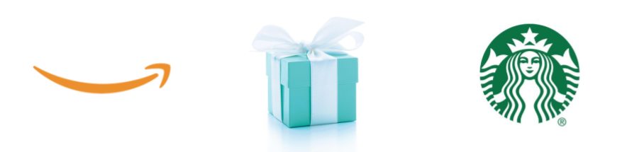
Back to color and symbols…what comes to mind when you see or someone mentions a brown van.. A brown delivery truck… UPS has done a great job of associating a color with it and not just on anything–brown on a cargo truck.
Besides the symbols, like we’re seeing in the orange smile on the left and the green mermaid on the right, we can recognize many types of symbols associated with the brands we love because the message and usage of its symbols have been consistent and repeated over time. We’ve assigned meaning to these symbols. Symbols are more than just a logo. Symbols are the fonts, colors, styles, words (special brand language), and attitude associated with a brand.
If you saw a paper cup with a lids on it and a large green circle with any type of artwork inside it, your mind will first think of Starbucks before it realizes the artwork inside isn’t a mermaid at all. Our brains process this recognition so quickly that we don’t have to consciously think about it. That’s the power of consistency and repetition.
Letters formed by different fonts create different associations stylistically, culturally, and historically.
Have you ever seen employees go rogue? Rogue employees are the ones who like to “personalize” their emails, for example.
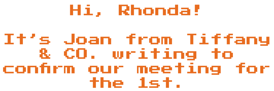
What if a rogue Tiffany’s employee used this font and color in her email to me? Would she be conveying the same elegance, history, and luxury? Consistency pays off.
Fonts are part of your brand message. You need to stay on-brand, which means staying on-message.
“Typography is the detail and presentation of a story. It represents the voice of an atmosphere or historical setting….”
— Cyrus Highsmith


If your significant other left you the first message, would you be a little creeped out? Like maybe you private security? Maybe if the note looks like second one, the security team can stay home.
Summary: 7 questions we asked and how we can answer.
- Do visitors know what problems you solve for them? Headlines
- Do visitors know what to do, like the next steps to move forward with you? CTAs
- Are you providing real value? Lead Magnets
- Can visitors easily scroll through your site? Mobile-friendly
- What’s your website’s social media experience? Social
- Am I sharing success stories to build trust? Testimonials
- Am I consistent with my message and how I share it? Branding
If you can start going through each item one by one, your website and social media experiences will be better for your business and more effective for marketing.
About Green Geeks & the Environment
Green Geeks is leading the way with eco-friendly web hosting that makes a positive impact on the environment. Does that statement generate more questions for you? Guess what–the internet, yes our online activities and the infrastructure that supports it, is actually a huge contributor to pollution. Green Geeks’ goal is to put back 3x the power they consume on the energy grid in the form of renewable energy.
While I’m not an anti-“fossil” fuel activist, I am indeed in favor energy diversification. So, I do support those who are in and those who support the wind, hydro, and solar energy industries, as well as those in and those who support natural gas, nuclear energy (the cleanest of all), and coal. Why? Because diversity of energy means that when one may fail, another quickly and easily supplements that. When the wind turbines freeze, solar, gas, coal, and nuclear (assuming they would always online, even at a low production rate) can offset that missing wind power. When Washington state is in the midst of its 9-months of rain and clouds, wind, gas, coal, and nuclear would offset that missing solar power. (I think you get the picture.) I find it’s important to point out that people can support all.
If you’re looking for hosting and your business is built on and around being environmentally friendly, like Anura Marketing, which serves the eco-tourism industry, you’ve found hosting supports that mission.
Green Geeks is a great alternative to traditional hosting, and I hope they continue to grow because the internet shouldn’t suck up so much of the other resources.
“Our hosting platform has been designed with a maximum use, no waste of resources mindset. Every aspect of our hosting platform is built to be as energy efficient as possible.
“In addition to this, for every amperage we pull from the grid, we match 3 times that in the form of renewable energy via Bonneville Environmental Foundation. We will also plant one tree for every hosting account that we provision on our hosting platform.
“Your website will be “carbon-reducing” when hosted on our platform. You can feel good that you’re helping make a difference by hosting on a platform that is eco-friendly.”
— Green Geeks


