The High Price of Simple: Why Minimalist Design Elevates Brand Value in San Antonio
Share this article.
Simple design isn’t simple to create. Learn how the illusion of simplicity increases perceived brand value for San Antonio’s high-end entrepreneurs.
The “Simple” Paradox
Ben Burns, Digital Director at Blind, once noted, “The simplicity of a logo creates higher perceived value.”
It sounds like a contradiction. If it’s simple, shouldn’t it be cheap? Actually, it’s the opposite. In the world of San Antonio luxury brands and high-growth startups, simplicity is the ultimate sophistication. When a brand looks “clean,” it tells the customer that the business is organized, confident, and premium.
But here is the secret: Simple design is not simply created. It is the byproduct of an in-depth study of letterforms, geometry, and visual weight.
Case Study: The Geometry of Judith Poe Jewelry
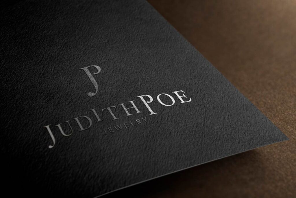
Take the logo I designed for Judith Poe Jewelry. At first glance, it looks like a graceful connection of two letters. But achieving that balance was an architectural challenge.
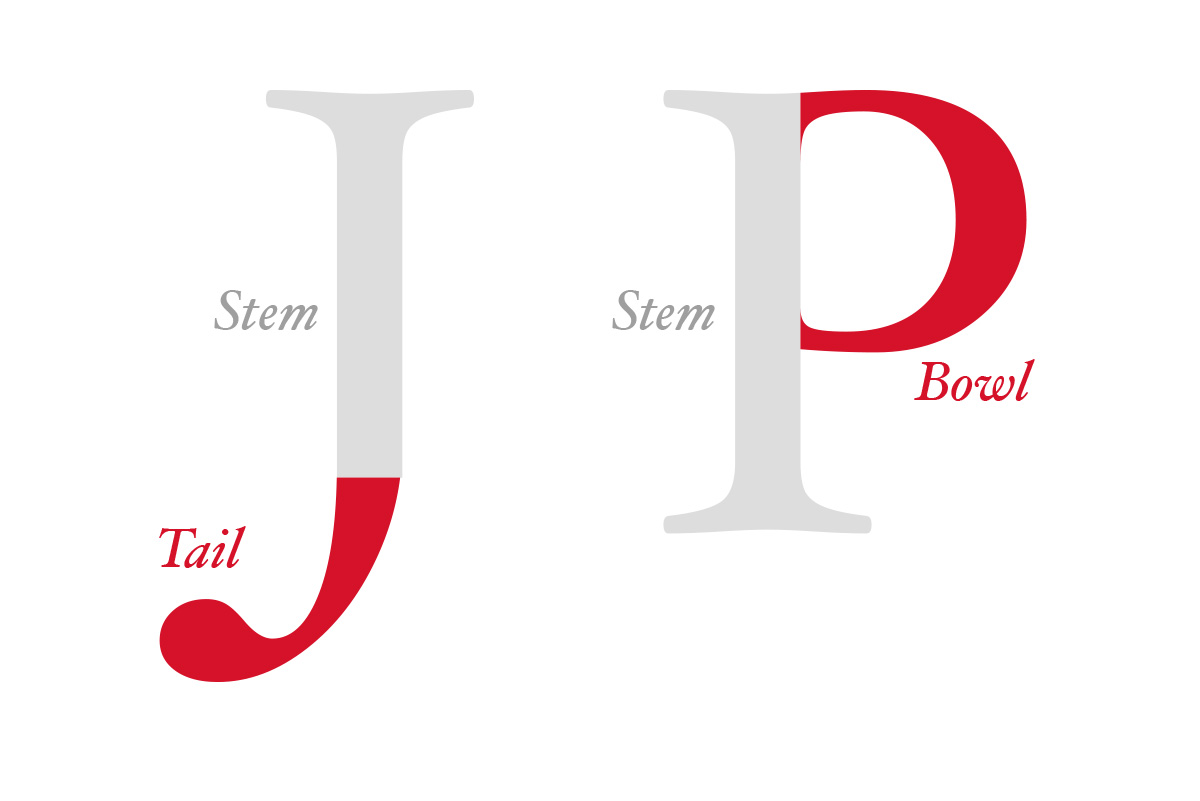
To create equal visual weight between the “J” and the “P,” I couldn’t just overlap them. The “bowl” of a standard “P” creates significantly more visual “heaviness” than the tail of a “J.”
- The Solution
I had to surgically open the P where the bowl meets the stem, mimicking the open nature of the J. - The Result
A balanced, elegant mark that feels like a single, fluid motion.
It looks effortless. It was anything but. That “illusion of ease” is exactly what creates the high-end perception Judith’s clients expect. (For a deeper dive into these mechanics, I highly recommend Ellen Lupton’s Thinking With Type.)

Context is Everything: From Austin Letterpress to Bexar County Digital
A logo doesn’t live in a vacuum. If you take a high-end logo and slap it on a discarded take-out container, you’ve instantly devalued the brand.
For Judith Poe, we didn’t stop at the digital file. We curated a color palette of silver and black and selected a specialty letterpress vendor in Austin, Texas. Why letterpress? Because the tactile, handcrafted texture of the paper mirrors the high-end custom nature of her jewelry. Whether her clients are in Boerne or The Pearl, the brand feels consistent and expensive.
The Paul Rand Standard
Paul Rand, the legendary designer behind icons like IBM and ABC, defined a successful logo through seven lenses:
- Distinctiveness
- Visibility
- Usability (Critical for today’s mobile-first San Antonio market)
- Memorability
- Universality
- Durability
- Timelessness
“Simplicity is not the goal. It is the by-product of a good idea and modest expectations.” — Paul Rand
Why Texas Founders Choose Simple
As a repeat founder, you know that your website and logo are often the first “handshake” you have with a potential partner or client. If that handshake feels cluttered or dated (hello, 1998!), you’re fighting an uphill battle.
Simple design is durable. It works on a giant billboard on I-10 and as a tiny 16×16 pixel favicon on a smartphone.
Explore Simplicity in Action: I’ve applied these principles of “complex simplicity” for businesses across Texas and beyond, including:
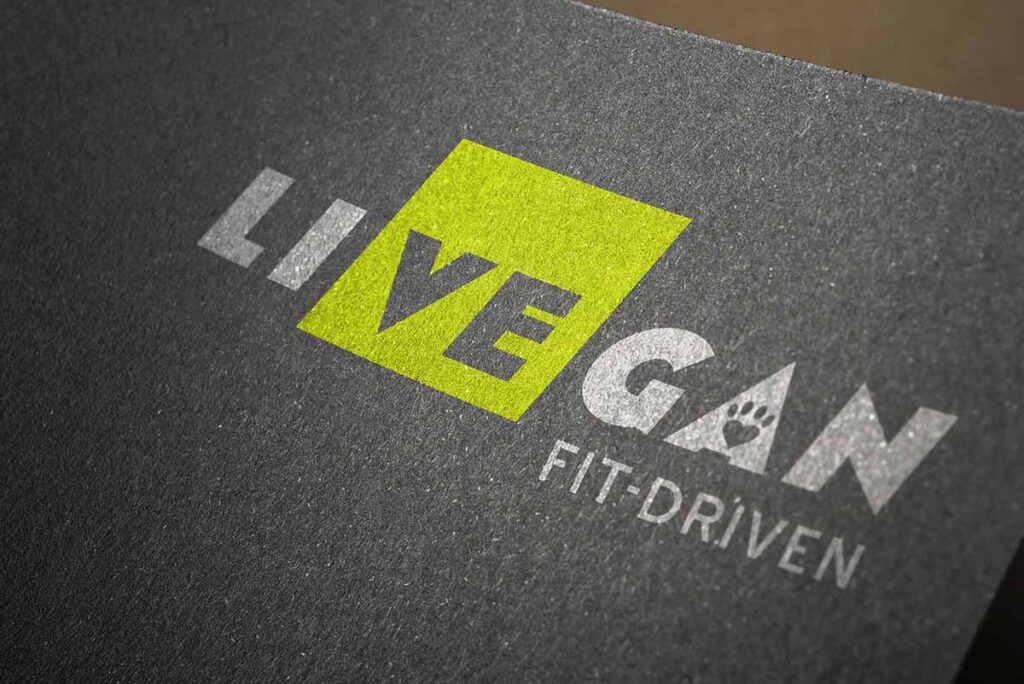
- LiVEgan: High-performance, fit-driven branding.
- Bradley Scott Commercial Real Estate: Elegant, traditional, luxe, tailored identity.
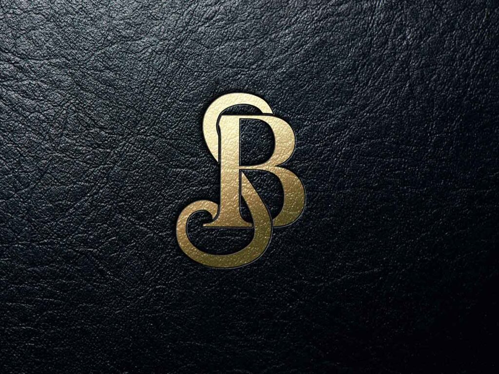
- Berman Photography: Where the mark steps back to let the art shine.
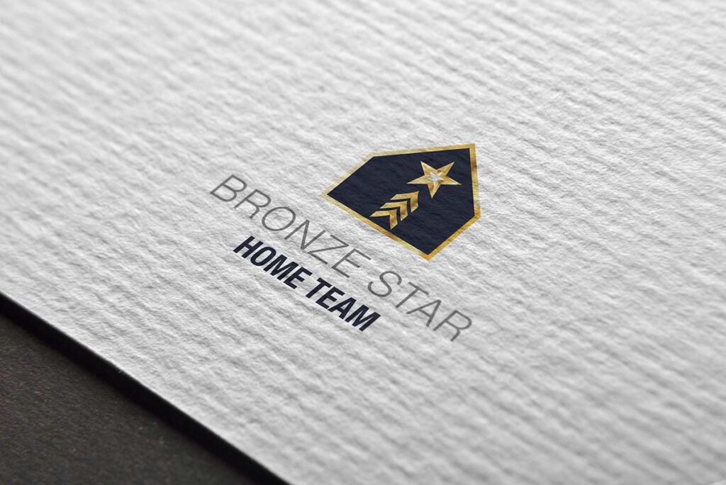
- Bronze Star Home Team: Clear, concise, and prestigious, just like the clients they serve.

Is your brand communicating “premium” or “placeholder”?
If you’re ready to elevate your business’s perceived value with a brand that’s built to last, let’s talk.

