Gulf Coast Conference
Client:
The Gulf Coast Conference (GCC)
Moving a legacy brand from "Geographic Literalism" to "Strategic Authority." Re-architecting a brand for scalability and cognitive ease.
GCC is a premier forum for chemical analysis technology. For decades, they have been the "Central Command" for subject matter experts, innovators, and industry leaders in the petrochemical and refining communities.
The Challenge
The GCC had a brand equity problem. Their original identity was tied to a specific geographic coordinate (Houston) and a dated aesthetic (gradients and complex overlapping type). While the conference was pushing the boundaries of global innovation, their visual identity was anchored in the past. For a scaling organization, a literal logo is a bottleneck. It creates a perception that the brand is local rather than authoritative, and stagnant rather than innovative.
The Strategy
Untethering the Brand: Our objective was to move the brand from an "Illustration of a Place" to a "Symbol of a Standard." Through our strategy workshop, we identified the need for a system that communicated collaboration, depth of expertise, and kinetic energy without the friction of geographic baggage.
Project Scope
Brand Strategy & Repositioning Visual Identity Design Monogram & Iconography Systems Color Strategy & Hierarchy
The Solution
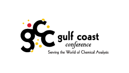
We replaced the complex map-based logo with a sophisticated, interlocking monogram and a dynamic color system. Interlocking Monogram: A bold "GCC" lockup that represents the collision of ideas and the strength of the community. The Constellation System: A series of color-coded nodes surrounding the mark. This serves as a visual metaphor for the diversity of thought and experimentation that defines the conference. Operational Versatility: We engineered the mark for Cognitive Ease. It was stripped of gradients and "noise," ensuring it maintains its integrity whether it's embroidered on a staff polo, printed on a massive stage backdrop, or appearing as a 16px icon in a browser tab.


The Result
A High-Performance Identity System: Scalable Authority: The new GCC brand is no longer a map; it is a destination. By modernizing the architecture of the brand, we elevated its perceived value to match its actual industry influence. The organization is now free to scale across new territories and digital platforms with an identity that reflects its future, not just its origins.
