Where smart design meets Texas tough. Discover how we built a relational data engine that handles communities, floor plans, and live inventory with a "single source of truth" architecture, reducing operational friction for a premier homebuilder. That’s exactly what we set out to do with Oakmont Homes’ new website—except instead of tile and shiplap, we
Rhapsody Realty Services, Keith Fahey
Marketing Consulting, Creative Direction
One Dog Solutions, Ryan Waterbury
Development Consulting
http://onedog.solutions/
Rhonda Negard
Web Design, Web Development
https://fatdogcreatives.com/about
The Data Congestion Problem: A homebuilder’s website is essentially a complex database in disguise. Oakmont was facing a "Scaling Wall":
- Data Fragmentation: Managing relationships between communities, various floor plans, and specific available homes was a manual nightmare.
- Redundancy: Updating a single floor plan meant manually hunting down and changing 17 different pages.
- User Friction: Potential buyers needed a way to filter by price, location, and square footage without feeling like they were navigating a spreadsheet.
The Challenge
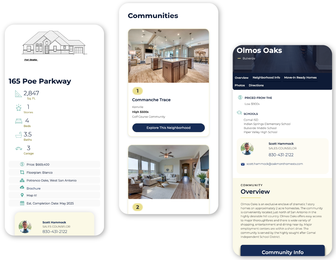
Relational Architecture: Inspired by high-performance platforms like Zillow and Redfin, we didn't just design a "gallery"—we designed a relational engine. The strategy was to create a "Single Source of Truth" for every data point. Using William Lidwell’s systems thinking, we built a backend where data lives once but appears everywhere it’s needed.
The Strategy
Relational Architecture: Inspired by high-performance platforms like Zillow and Redfin, we didn't just design a "gallery"—we designed a relational engine. The strategy was to create a "Single Source of Truth" for every data point. Using William Lidwell’s systems thinking, we built a backend where data lives once but appears everywhere it’s needed.
Project Scope
Complex Data Architecture & System Mapping
Custom Post Type & Relational Database Development
UX/UI Design Optimized for Mobile Conversion
Dynamic Search & Filtering Integration
Performance Tuning for High-Resolution Imagery
The Solution
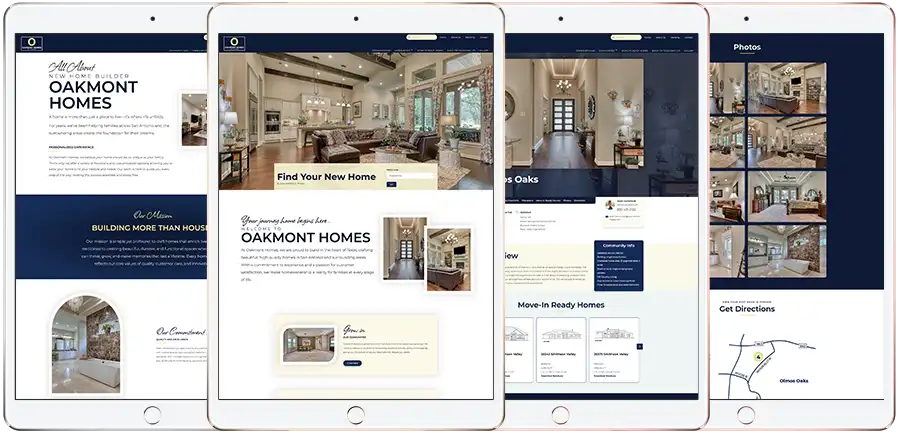
Dynamic Cascade Logic: We moved away from static pages and built a custom infrastructure using Custom Post Types (CPTs) and Custom Fields. The "Barbecue" Data Model: We established a hierarchy where Floor Plans, Communities, and Homes are interconnected. If you update the price of a specific floor plan, that change "cascades" site-wide instantly. Cognitive Ease for Buyers: We implemented smart filters and eye-scanning patterns (Z and F patterns) to ensure users find their dream home in seconds. The front end feels like a "linen shirt on a hot Texas day"—light, crisp, and breathable. Operational Autonomy: We built the "Engine Room" so the Oakmont team can toggle a home’s status to "Sold" with a single click, instantly updating every gallery and community page without touching a line of code.


The Result
Built Smart From the Studs Out: The Oakmont Homes website is now a high-performing asset that respects the user's time and the founder's sanity. By eliminating technical debt and manual redundancies, we’ve provided a system that allows their team to focus on building homes rather than battling their website. It is an error-proof environment designed for the long game.

