Client:
SSF Running
Visualizing the Mechanics of Performance: Stephanie of SSF Running is not just a running coach; she is a specialist in body mechanics and endurance. Her coaching philosophy—Stronger. Smarter. Faster.—is built on the intersection of physical strength and strategic biomechanics to help athletes redefine their personal limits.
The Challenge
The Challenge: Beyond the "Runner Silhouette" The running industry is saturated with generic "action" logos—silhouettes of runners, tracks, or shoes. These failed to capture Stephanie’s unique competitive advantage: The Complexity of "Smarter": The branding needed to convey that her results come from a deep knowledge of body mechanics, not just "running more miles." Elevated Performance: The brand needed to feel premium, strategic, and high-performance, appealing to athletes who are looking for a scientific edge. The "Invisible" Edge: How do you visualize the knowledge behind the movement?
The Strategy
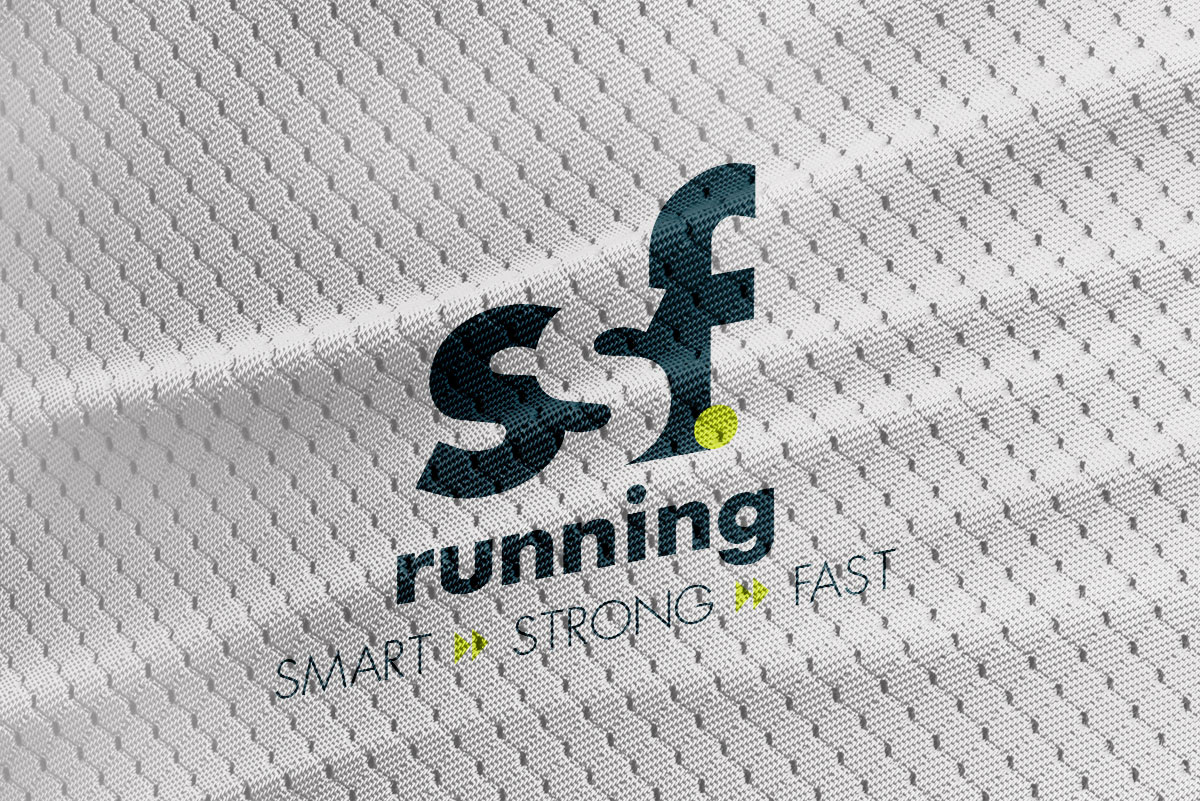
The Intelligence of Negative Space The strategy focused on William Lidwell’s principle of Figure-Ground Relationship. We wanted to create a visual "aha" moment that mirrors the strategic breakthrough an athlete has when they begin training with SSF. By using negative space, we could imply that there is "more than meets the eye" in Stephanie’s coaching—highlighting the hidden mechanics that lead to faster times.
Project Scope
Specialized Brand Identity & Logo Design
Typography Strategy & Custom Letterform Development
Visual Competitive Advantage Analysis
Negative Space Branding Framework
The Solution
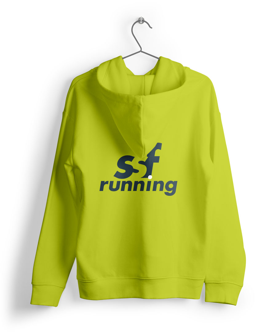
The Solution: A Strategic Typographic System We developed a unique mark that blends traditional letterforms with negative space to represent the "Stronger. Smarter. Faster." methodology. Negative Space Integration: We utilized negative space within the "SSF" letterforms to symbolize the hidden strength and body mechanics that Stephanie unlocks in her athletes. It represents the "missing piece" in traditional training. Typographic Contrast: By mixing standard letterforms with specialized negative space forms, we subtly emphasized a strategic, non-linear approach to performance. It signals that this is an elevated space for serious athletes. Kinetic Minimalism: The design remains clean and athletic, ensuring it scales perfectly from social media avatars to high-performance apparel. The movement is implied through the geometry of the letters rather than a literal drawing of a runner.


The Result
A Brand That Redefines Limits The new SSF Running identity immediately differentiates Stephanie in a crowded market. It moves her from "coach" to "specialist." The logo doesn't just name the business; it explains the why behind the results. It is a bold, intellectual handshake for a brand that is redefining the limits of what its athletes can achieve.

