Engineering a "Rain or Shine" Event Experience:
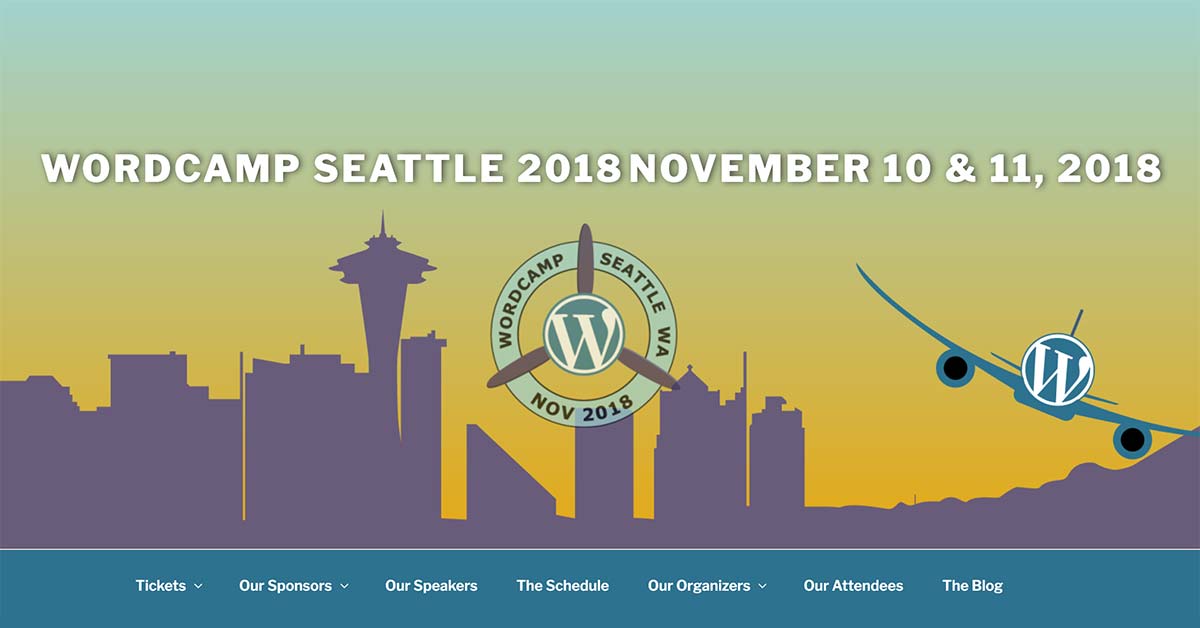
WordCamp Seattle is the premier annual conference for the WordPress community in the Pacific Northwest. Part of the global WordCamp Central network, the event brings together hundreds of developers, designers, and entrepreneurs for a multi-day educational summit.
The Challenge
Designing Within a "No-Plugin" Fortress: Leading the creative for a WordCamp is a unique challenge that tests a designer’s ability to communicate with developers under strict constraints: The Technical Ceiling: WordCamp Central dictates that sites must use WordPress Core themes and a very limited list of pre-approved plugins. No page builders or external frameworks are allowed; every design element must be hand-coded by the dev team. The "Grey Skies" Reputation: Since the event is held in November, attendees are often wary of Seattle’s infamous rain. The brand needed to address the weather without being a "downer." Role-Based Complexity: With hundreds of speakers, sponsors, attendees, and volunteers, the event required a massive volume of distinct signage, badges, and handouts that remained cohesive.
The Strategy
Embracing the Atmosphere: The strategy focused on William Lidwell’s principle of Expectation Effects. Instead of ignoring the November weather, we decided to "Embrace the Rain." We developed a concept that capitalized on Pacific Northwest camping culture, positioning the rain as a "local personality" rather than an obstacle. To counter the winter gloom, we chose a vibrant, high-energy palette inspired by summer-time nature to lift the mood and build anticipation.
Project Scope
Creative Direction & Event Concept Development
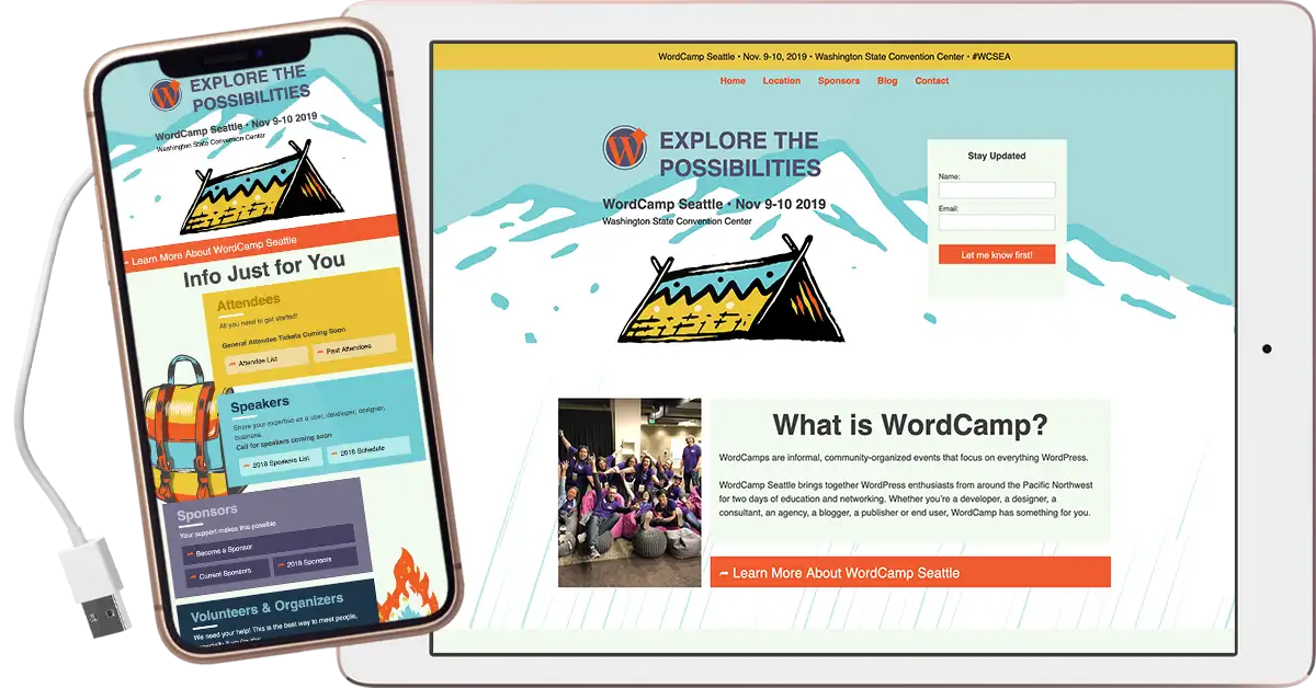
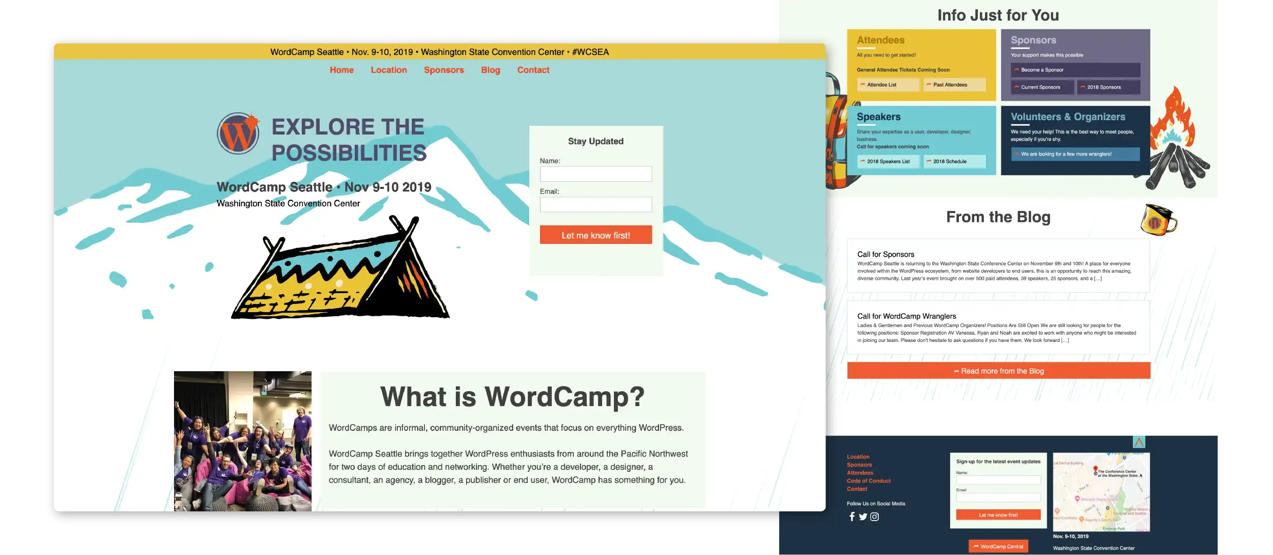
UI/UX Design for Restricted Technical Environments
Identity Design & Environmental Graphics
Role-Based Badge & Signage Architecture
Volunteer Team Leadership & Technical Handoff
The Solution
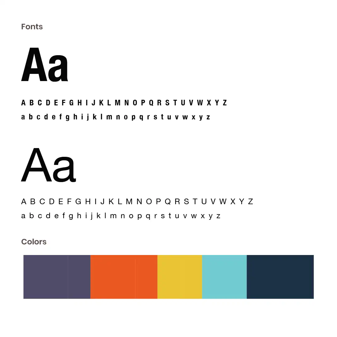
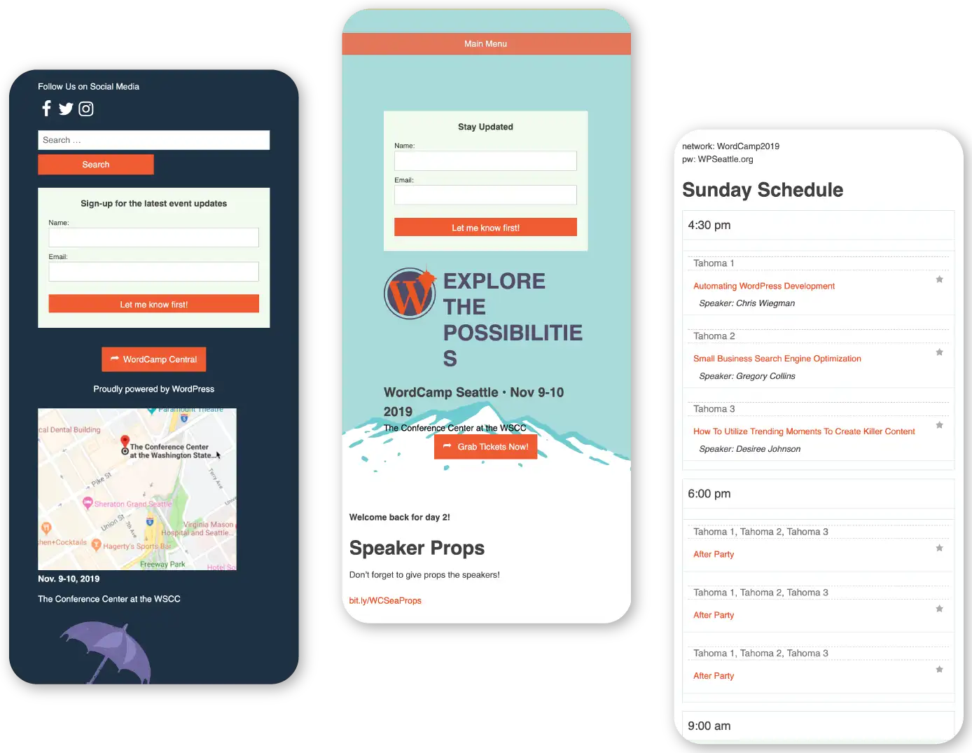
A Cross-Platform Visual System: I served as the Lead Designer, overseeing the visual concept from digital interface to physical collateral, coordinating closely with a team of volunteer developers to bring the vision to life. "Wet Streets" Visual Identity: We developed a palette using #1C3245 (Wet Streets) as a foundation, accented by #EAC234 (Sunshine) and #72CBD3 (Rain). This created a "Vibrant Nature" aesthetic that felt authentic to Seattle but energized for a tech event. Constraint-Based UI Design: I designed a user-focused website architecture that prioritized "Role Identification." By creating clear paths for speakers vs. sponsors, we simplified navigation within the restrictive coding environment of the WordPress Core theme. The Physical Experience Suite: I designed a massive array of print assets, including: Role-Specific Badges: Custom designs for 7 different attendee categories. Wayfinding Signage: High-visibility graphics to guide users through the venue. Event Printables: Handouts, stickers, and reference guides that mirrored the digital experience. Collaborative Leadership: I worked in lockstep with Lead Organizer Ryan and the development team to ensure that my visual concepts were technically feasible within the "no-builder" constraints, resulting in one of the smoothest handoffs in the event’s history.
The Result
A Masterclass in Community Branding: The 2019 WordCamp Seattle was a resounding success, cited by organizers for its ease of navigation and distinct personality. We proved that design constraints are not barriers, but rather a framework for better creativity. By leaning into the local culture and prioritizing the user’s journey, we created a "Rain or Shine" experience that attendees could truly embrace.
