Evolution of a Logo: Wild Child Group
Share this article.
The original logo and concept are clever with the shape of the elephant’s face, changing directions at the trunk and tusks. However, there are three reasons why this clever logo wasn't working as effectively as it should.
Evolution of a Logo:
Wild Child Group
Thinking Galactically, Acting Globally, Responding Locally
Candace Thompson, Wild Child Group, provides business consulting. She works her clients hard. Her process involves a lot of work on their part. Candace looks at the numbers and creates a strategic plan to propel the business to the next level. She lives and breathes her tagline, “Disrupters of Normal.” This means, don’t be satisfied with status quo or risk missing out on significant growth and legacy.
While the original logo and concept are quite clever, it did not possess that “next level”, high-end, highly knowledgable and experienced professional feeling or look. However, its cleverness with the stripes contour with the shape of the elephant’s face, changing directions at the trunk and tusks, definitely emphasized the disruption of the expected aspect of the business. We didn’t need to start from scratch with the logo redesign.
The goal for the update also focused on the following three technical aspects:
- With social media significantly influencing logo design, logos must be both visible and legible in a small, square or circular shape. Basically, a logo needs to be designed to fit on a postage stamp.
- The fine details of the stripes where they drop off were getting lost, especially when scaled to a small size, and problematic for reproduction.
- The typography needed some fine tuning for aesthetics and modernity.
Before & After Logo Design
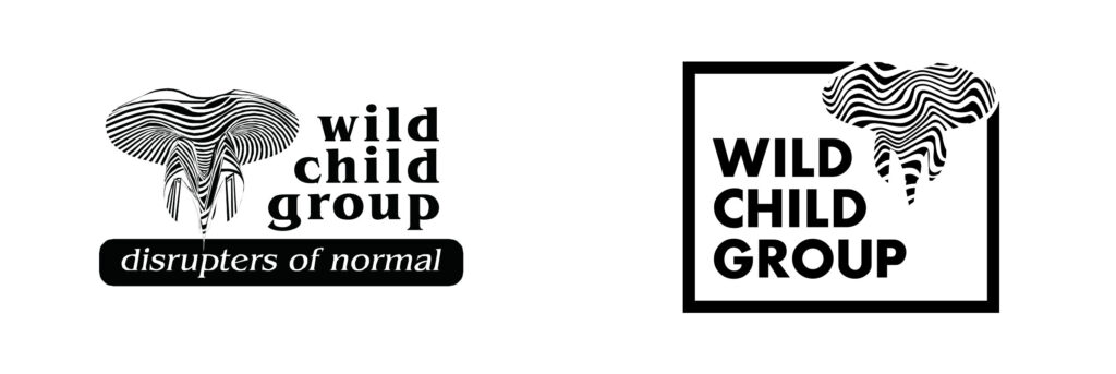
Wild Child Group logo before and after

Wild Child Group rebranded logo
The Logo
The new design plays on two conceptual contrasts. The tag line, “Disrupters of Normal,” is the foundation for this design. The visual of “normal” is represented in the box with clean straight lines. Then, the zebra striped elephant head “disrupts” that element in the upper right corner. The idea is to further illustrate the contrast between what is expected and the disruption.
I chose a modern, clean typeface. The name and tagline are both in all caps to feel like they’re “screaming”. With the name and tagline, it would be easy to go completely busy and wild, but this is a professional business consulting service, so professionalism is still important. With the typeface update, Wild Child Group is solid and updated.
The Business Cards
I used the zebra stripes as a design element we could repeat for interest and as a vehicle to add color. I chose a fun combination of greens and reds that don’t look Christmas-y.
These colors evoke excitement and energy with the black serving as a stability. The contrast between the reds and green provide significant visual vibration and contrast, which is the source of the energetic feeling.
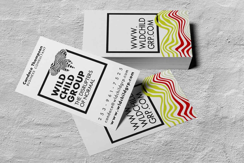
Wild Child Group business cards
The Business Document set
A combination of wild and serious, you can be confident with this design that your business coach knows what she’s doing and truly lives by her mantra, disrupt normal. When Candace sends a piece of mail, it will definitely standout!
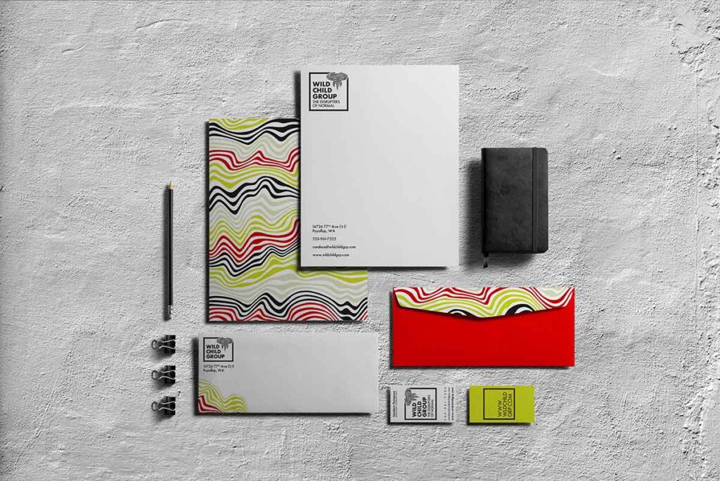
Wild Child Group rebranded documents
