A Dragon, a Widow, and a Bird: A Case Study on Rebranding Bridget Willard, LLC
What do a dragon, a widow, and a bird have in common? It’s the start of a joke, right?
The Inside Scoop, a Story for Context
These are actually parts of the story of my latest client and newest friend, Bridget Willard. She packed up her life and business last year (2020) to uproot herself from her former life and start on a journey from California to Texas of discovery and evolution. Yes, this already thriving business woman was in need of change and only a kind of change that would help her grow and move beyond the former Bridget she and so many others knew, the wife of her late husband.
I know we can all imagine that kind of pain. Few of us have lived it but eventually will. Even fewer know the strength and courage it took to recognize the need and actually make steps toward releasing herself of her former role as caregiver, lover, friend, and confident. That courage? She has a tattoo of a dragon that she got as a reminder of it.
I would have said if asked it would take her a few years after moving to settle into her new hometown and learn who she was without any outside influences. We are all so easily influenced by those we share most of our time. But, this is a short story–for now because she’s been in San Antonio, Texas for less than a year and already has a foundation of quality friendships. It’s a bit long for a backstory, I know, that makes you wonder if this is a real case study or a tribute to a friend. It’s a bit of both.
I first met Bridget in person at the 2017 WordCamp Seattle but on Twitter in 2016 after another friend and colleague, Robert Nissenbaum, appeared on her marketing show. They’re both marketer and Twitter experts, so I learned a lot from their discussions and started following her for more. Well, I was an intermittent Twitter user.
I’m a full-on Twitter convert now.
What sold me on Twitter was that she said Google indexes tweets. I knew immediately what that meant and jumped into the bird’s nest with Twitter. I really started seeing what Twitter offered that the other social media platforms did not through our many business discussions over lunch. I also learned just how well-read she was, including on technology, languages, history, and tech products. She’s far beyond most people, including other tech marketers.
“You’re stealing from others because you’re hiding your gifts.” That was a statement the Instrovert, Peppa, had told me more than a year ago, which I repeated back to Bridget. “You’re not sharing your tech knowledge. No wonder your tech clients don’t think you understand their world.” She did and does understand it–very well, in fact. It was shortly afterwards that her Tech Developments became a regular feature in her blog. Her clients, both former and future, started to see her depth of knowledge.
Witnessing the effects a small change made was pretty intriguing.
Not only did she start warning her tech clients, leads, and peers about pending server and WordPress core changes and implications, she also jumped into producing tech herself! She conceptualized, wrote and, with the help of Media Ron, developed the WordPress plugin, Launch With Words.
A fast follow-up to that was the book directed right at her ideal clients called How to Market Your Plugin: A framework for the sleep-deprived developer. When she gets it, she gets it.
You can see how just in a short period of time Bridget Willard has changed her life and created new projects and products. She’s experienced and still experiencing significant growth as a person and a professional.
How can we harness that energy, stamina, and focus? She’s got a video for that–at least that’s my guess. And, the point of all of this is so you can witness what I have witnessed and get the inside scoop on how and why we started a website redesign that turned into a complete rebrand.
The Rebranding Process
Months ago, I shared some archetype quiz resources with Bridget in order to help her focus on a persona that she could naturally apply and one that her audience could follow and understand knowing that, at some point, we would likely go through a rebranding process. This would help her explore the archetype over time, refine her message, and be ahead of the game whenever we started rebranding.
When we started our regularly scheduled website refresh (something we planned to always do every 12-18 months), we wanted to shift our focus from the DIY heavy milk and cookies theme to something more sophisticated and appropriate for her audience, which had already expanded to outside of WordPress. While she still creates a lot of DIY content, she has products for sale that support DIYers. So, DIY is not all recipes anymore; it includes tangible products and SaSS (software as a service) products. Acknowledging that the DIY of milk and cookies was more feminine than her 90% male clientele, we decided to scrap milk and cookies altogether.
We talked about her audience changes and challenges and her desires for her business. Ultimately, Bridget had evolved into a bit of a connoisseur or bourbon, which was a great reflection of her business and emotional maturity. But, it’s not about her. It’s about her audience, which has also matured and become more sophisticated. They still need and want a guide but are drawn to more intellectual resources that incorporate the tactical steps she’s always been providing with intellectual theory put into practice.
As we discussed how we would incorporate all of this into a new website design, Bridget said, “I think I want a complete rebrand to reflect who and what I am now and who my clients have become and how they’ve evolved.”
After multiple exercises we honed in on Bridget Willard, LLC’s key brand attributes. She and her business are friendly, funny, and encouraging. The impact her work has on her clients is increased confidence for more sales by offering practical advice without gimmicks, with no B.S., but with actionable advice. These attributes combined with social media marketing, marketing consults, and training as the delivery vehicles make a powerful and unique business and impact.
After taking quizzes on archetypes, we learned that she is primarily the sage (intellectual) and secondarily the visionary (creator). The sage and creator together call for scholastic, clever, and innovative design. Her third but less dominate archetype was the caregiver.
The logo Design and Symbolism
This is how we landed on bourbon, not just something for which she is cognoscente, but also a symbol of fine Americana whiskey, historical association with intellectual conversations, simple sophistication, and innovation. All of these characteristics complement her brand attributes and archetypes.
We focused first on the logo mark, the glass. A whiskey tumbler, naturally, was the start. Initially considering the social aspect of drinking and toasting, I struggled with how to demonstrate that notion. Cheers is definitely a self-esteem/appreciation act that a caregiver might initiate.
When filling the glass, we stopped at the two-finger pour, something another connoisseur would notice and appreciate. While one spherical ice cube is ideal in the glass for only a brief moment, we agreed that three smaller ones playing double duty on symbolism for ice and the well-known iMessage ellipsis. Those ellipsis led to yet another small detail, the speech bubble tail inside the whiskey, which symbolizes the social and conversational approach she has to managing social media accounts for businesses. The final symbolic element is the hashtag in the upper left. Initially meant to be a sweat bead, the hashtag evolved from a drop and “smudge” or “crack” on the glass to show dimension and realism. We settled on the hashtag to further emphasize the media aspect of social media.
The Formula
ellipsis (anticipation) + bourbon speech bubble (social) + hashtag (media) + glass (cheers)
Whew! That’s a lot of symbolism for one mark, which meant I had to make sure to keep the design very simple and possibly strip away an element or two. Thankfully, I was able to make it work with all of those and remain simple.
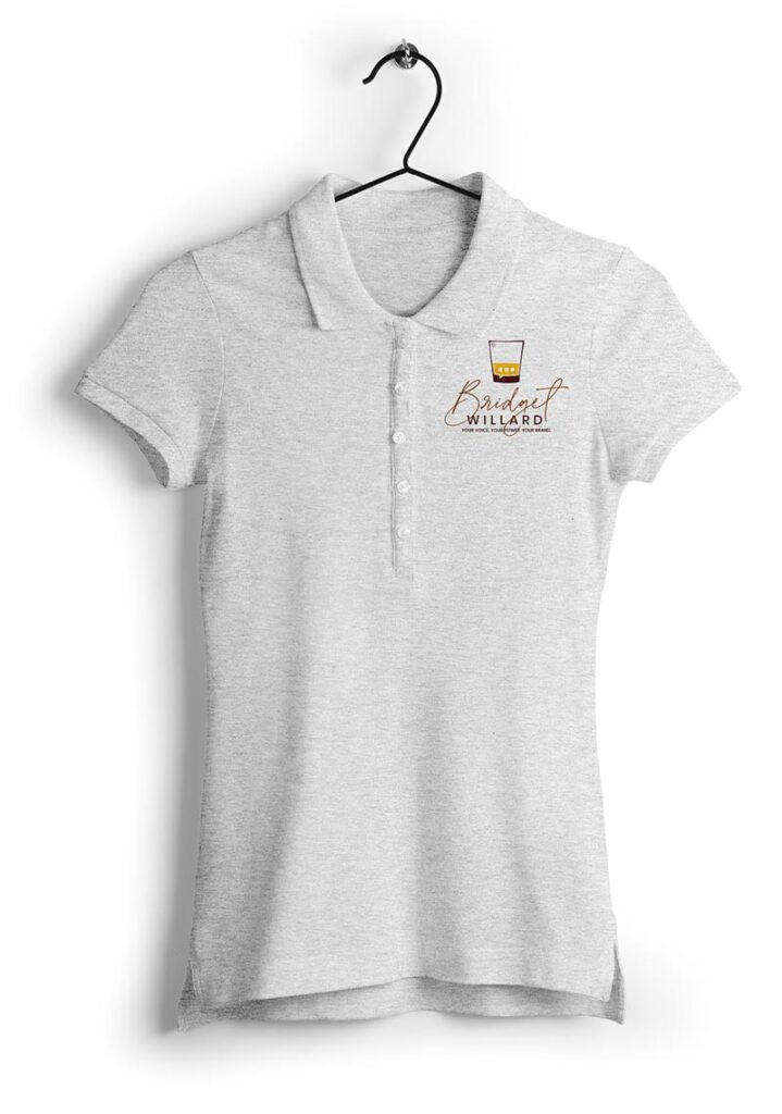
The typography for the logo was equally symbolic. “Bridget” is in a very sophisticated yet realistic script font that blends the intellectual and personable, friendly attributes. Combining it with a stylistically opposing font in all caps with wider kerning provides stability (visually and symbolically) and openness to new ideas (visionary) for “Willard”.

Color Palette
The yellow for creativity and innovation next to reds and brown create a bit of tension and a lot of contrast. The tension between the yellow and reds and oranges emphasize a struggle, which leads to innovation. The dark browns offer a grounding and calming effect from the tension between the yellow and reds and oranges. The yellow was also visually a more palatable color for the whiskey speech bubble, which meant the dark brown for the glass was also a visually palatable way to ground and contain the logo mark.
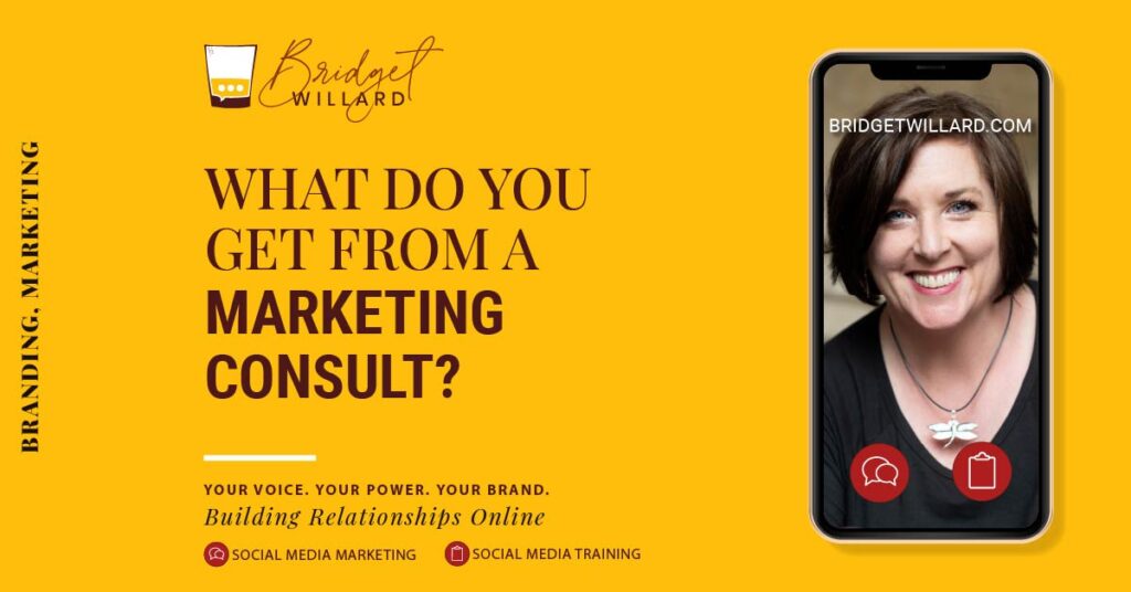
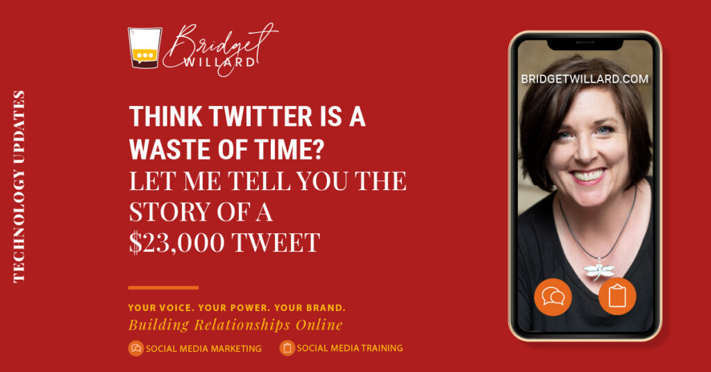
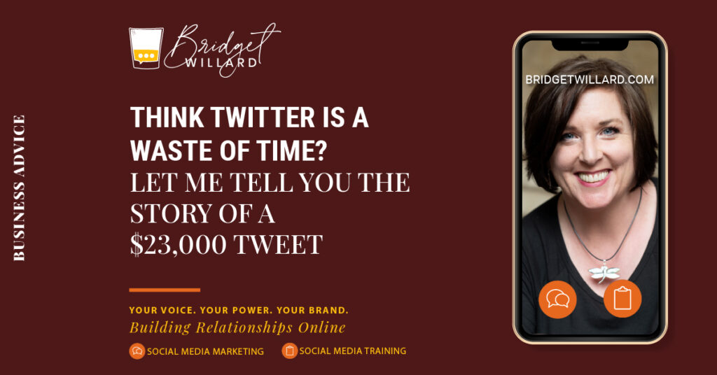
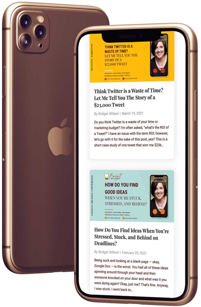
We also used colors on her social media sharing graphics to represent categories within her blog, like yellow for branding and marketing, red for tech, blue for content, and deep red-brown for business advice.
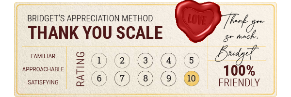
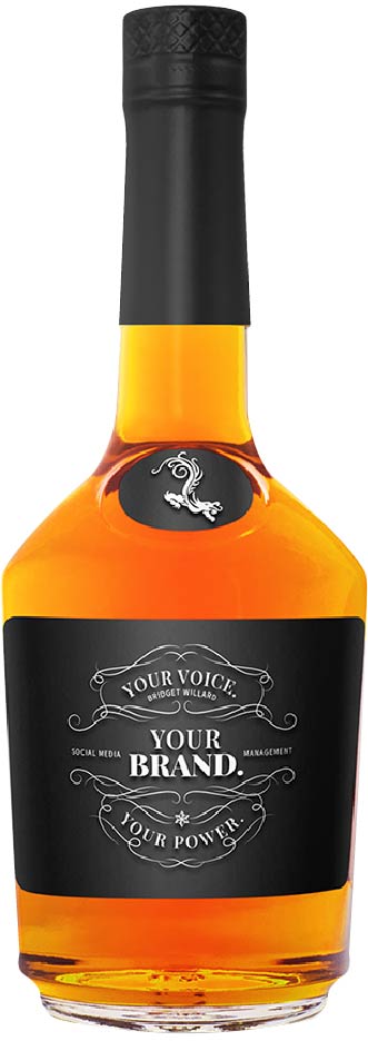
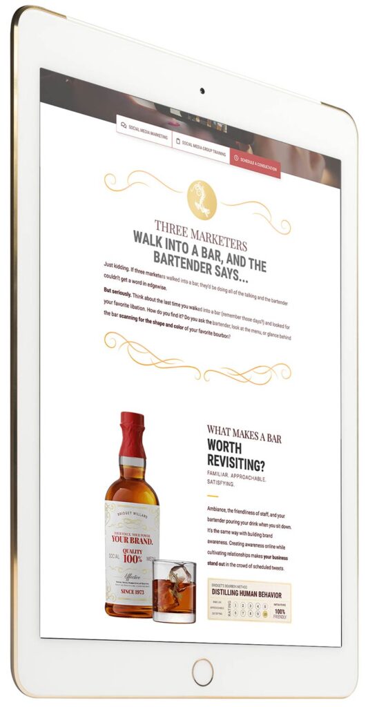
We developed a lot of graphics for use in social media, email, and on the website playing with the type, colors, and style of bourbon labels.
Professional Photos
The last and rare service was photographing her. I wanted to make sure we had professional-style photos for all of the designs for incorporating her into them.
All parts of this rebrand complement the others. Bridget Willard, LLC now reflects the sophisticated, knowledgeable, compassionate teacher that Bridget is.
What are your thoughts on the rebrand?
This was one of the most fun rebrands I’ve done!
Next up, I’ll blog about the website redesign, which was also one of the most fun websites I’ve worked on…and largest. Yes, she’s got a large site with a lot of pages and content.
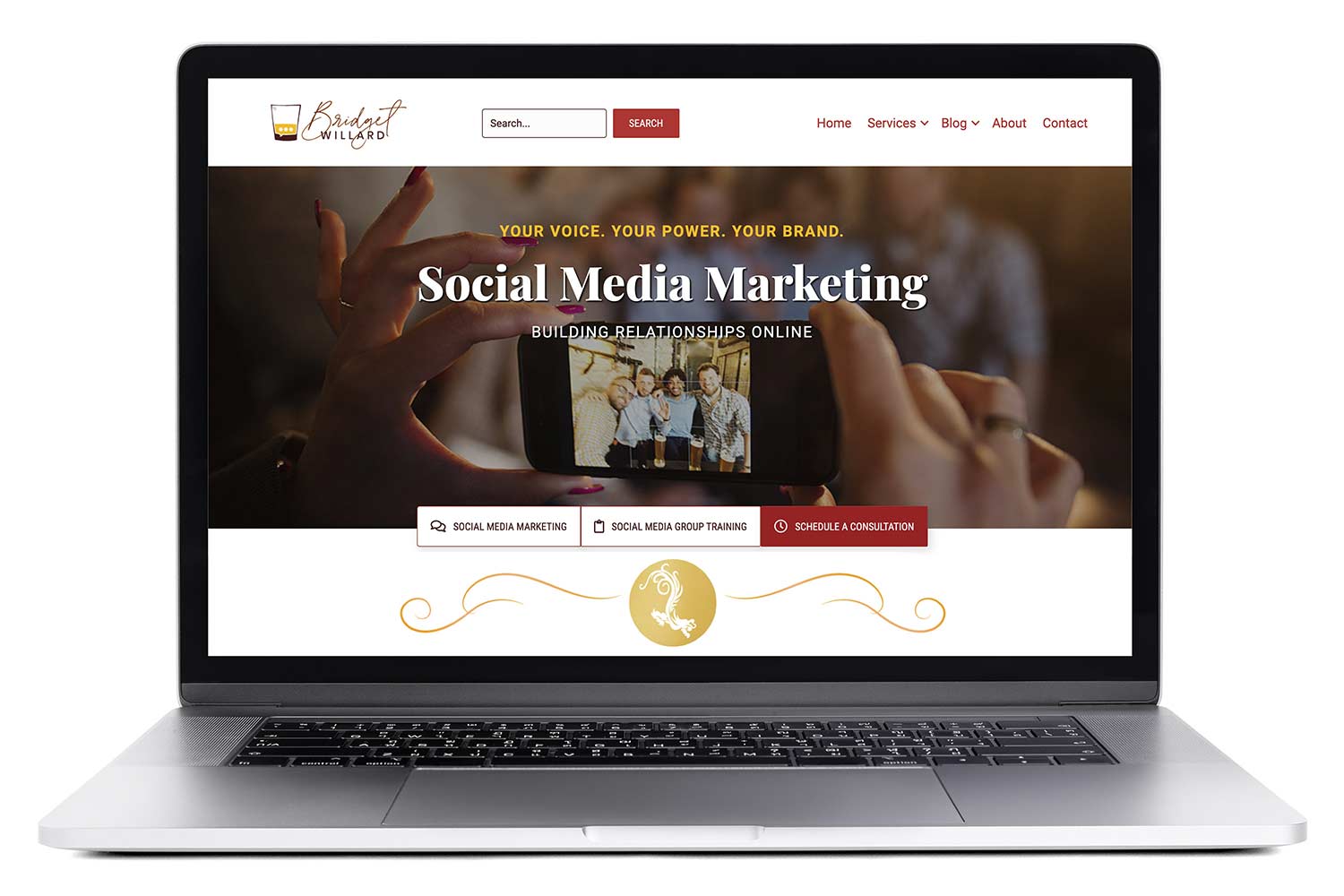
For now, visit her redesigned website, which we launched in May 2021 or view the portfolio page on this site.
