Brand Architecture: Why We Untethered the Gulf Coast Conference
Share this article.
A logo isn’t just a symbol—it’s a strategic tool. For Gulf Coast Conference, we transformed an outdated, location-bound logo into a modern, scalable identity that reflects who they are today: connected, innovative, and industry-savvy. This wasn’t just a redesign—it was a repositioning.
The Problem: A Literal Map in a Digital World
If you’ve launched more than one company, you know that your initial brand often carries “geographic baggage.” You start in Houston, so you put a star on Houston. You start in the 90s, so you use a drop shadow.
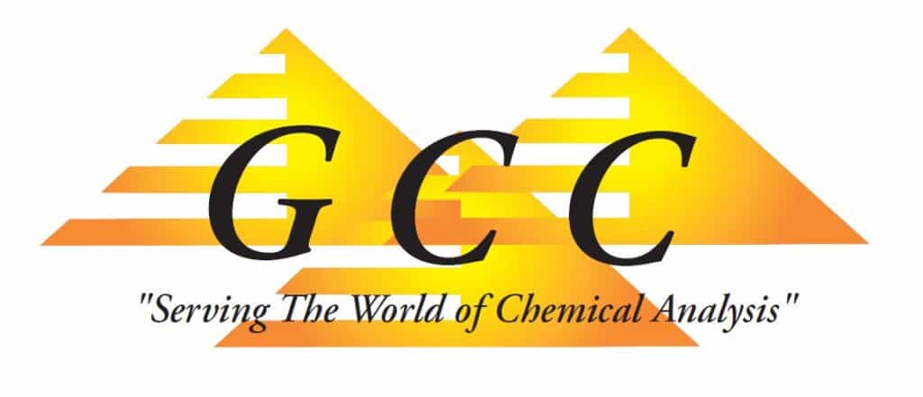
The original Gulf Coast Conference logo suffered from this “Literal Trap.” It was a map. It was a location. It was a complex weave of overlapping type and gradients that didn’t scale. As the organization evolved into an innovative, industry-leading event, the brand stayed stuck on a physical coordinate.
For a founder, a literal logo is a ceiling. It tells the world where you were, not where you are going.
The Strategy: Repositioning Through Restraint
We didn’t just “refresh” the design; we re-architected the identity. Through our strategy workshop, we identified four core pillars that the old brand was failing to communicate:
- Subject Matter Expertise (Authority)
- Approachable Connection (Community)
- Deep Collaboration (The “Network” effect)
- Kinetic Innovation (The future)
The goal was Cognitive Ease. We needed a mark that the brain could categorize instantly as “Professional/Leading Edge” without the distraction of geographic puzzles.
The Solution: A System, Not a Sketch
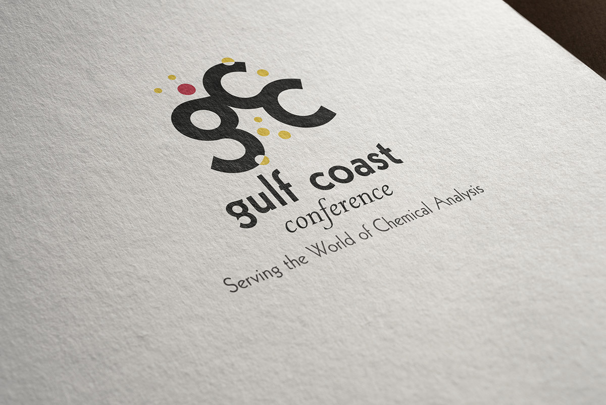
We stripped away the complexity to reveal a high-performance monogram.
The Interlocking “GCC”: A bold, simplified lockup representing the collision of ideas. We replaced “geographic proximity” with “intellectual connection.” The interplay of the letters suggests depth and collaboration—the very reason people attend the conference.
The Constellation of Innovation: Surrounding the monogram is a system of color-coded nodes. These aren’t just dots; they are a visual metaphor for experimentation and the diversity of thought found in the labs and boardrooms of their attendees.
Operational Durability: Because I design for the fifth year of ownership, this mark was built to survive reality:
- No Gradients: It works in high-fidelity color or a single-color stamp.
- Vector Precision: It scales from a tiny 16px favicon to a 40-foot stage backdrop without losing its integrity.
- Zero Geographic Baggage: The conference is now free to grow anywhere, unburdened by its original Houston coordinates.
The Result: High-Value Perception
The new Gulf Coast Conference brand doesn’t just “look better.” It means more. By moving from a literal illustration to a strategic system, we elevated the perceived value of the entire event.
When your visual identity is built on a foundation of clarity and restraint, you stop selling a “location” and start selling a Standard.
The original GCC logo (right) was outdated, tied to its location, and did not fully represent the organization’s depth of knowledge or connections.
