
Evolution of a Logo: TrainLifeFit
Share this article.
This is one of my favorite examples of collaboration with Billy Holmes (illustrator), the client, and myself giving feedback, insight, and experimentation.
Sumair Bhasin, owner of TrainLifeFit, contacted us about a redesign of his logo. His beef with his current logo was that it didn’t encompass all that it should.
He needed a logo that embraced his philosophy and approach to his training. He’s not just about “getting ripped” or being able to lift lots of weight. That didn’t sound like a typical trainer to me, so I was intrigued. He is about whole health, healing, eating, moving, the way the body should and at its best. His philosophy is deeply rooted in Eastern practices, which he wanted most represented in his logo.
Keeping the design on track required redirection at times, but together, we created a great, effective logo that will stand out among his competition in the marketplace. Initially focused on a “stencil” and wider font, we cautioned that it would be too “army” and not inline with Eastern design. However, I’m not one to completely ignore the client. It’s the client’s logo. I always want him/her/them to love it and to be and feel involved in the design process. (Of course, Sumair was involved from the beginning as he had sent us some sketches of what he had in mind.)
I choose a condensed style font for the logo type. This condensed font emphasizes height over weight, creating a more trim, sleek, or fit, feeling. I added notches in the font for two reasons:
- It achieves Sumair’s desire for a “stencil” font without veering from the influence of Eastern design (and from looking too much like his competition, which uses “army” styled fonts abundantly).
- The negative space is cutting through the hard letter forms, symbolic also of his philosophy.
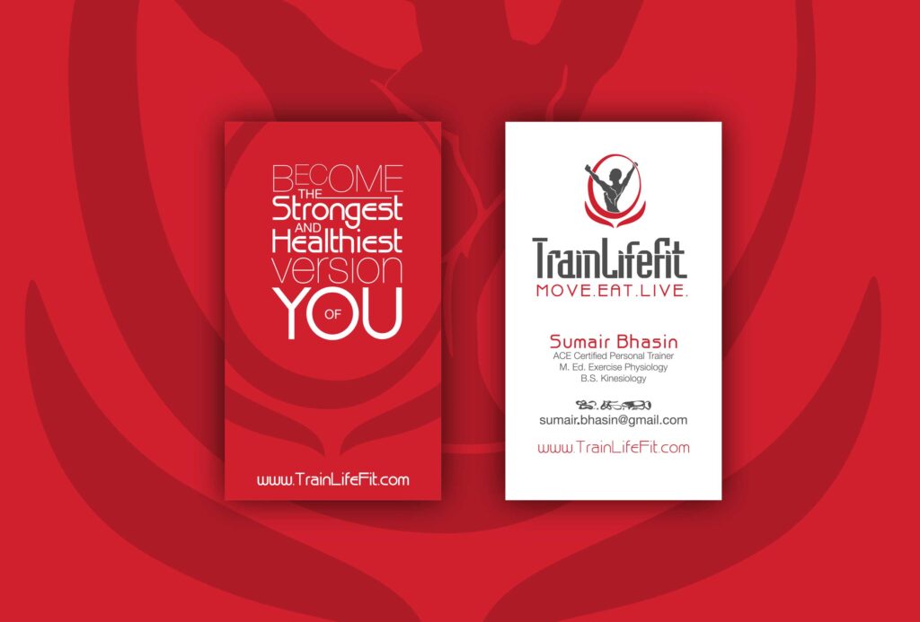
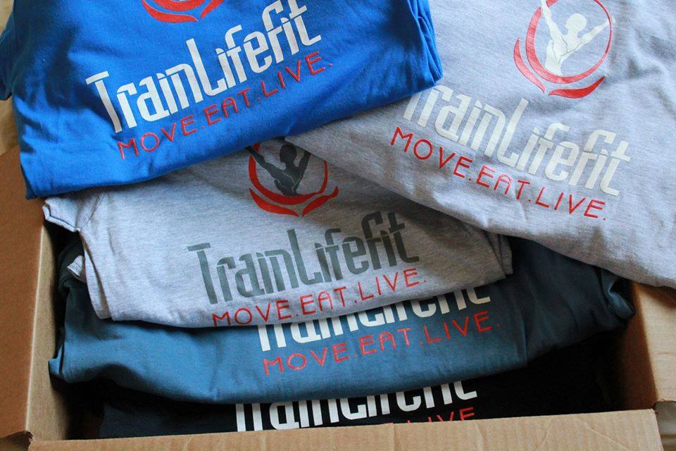
With with higher-than-average x-heights (higher center of gravity) and the additional letter-spacing, the tagline font helped to emphasize ideal fitness–the ideal shape being more broad across the shoulders and slimming from there. The light weight of this font and the wide kerning (space between letters) gives a foundation, “breath” and contrast between the tagline and logo type.
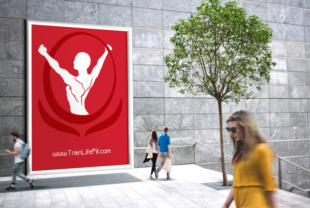
Billy, the resident and highly regarded illustrator, went to work on Sumair’s sketches. We went through several drafts and tweaks even before sharing with Sumair. The victorious arms up and the chiseled upper body are a very literal representation of Sumair’s business and philosophy. Enclosing it in the lotus flower created a nice contrast–hard and soft. The lotus flower is the symbol of Buddhism, purity of the mind and body regardless of the mud (chaos or trash) in which it is rooted.
As for the colors, it took a lot of back and forth. Billy and I had 2 different ideas of what would work best–he tended towards more organic, earthy colors while I was leaning towards higher contrast colors. In the end, we chose gray and red. The red (PMS 186) is vibrant and strong and nods to the well-known flags of Japan (red, rising sun), China and Taiwan (solid red background), and Thailand (red stripes). Also, red being the color of the blood of life is very appropriate. The gray is a “gun-metal” for strength and the typical color of free weights. The two concepts provide a contrast of the fluidity of blood used in a soft element, such as the flower, and the rigid, solid mass metal of the letters and figure in the icon.


