You’re the alpha dog. That’s why they asked you to speak. Do you need your logo on every slide? No.

Why You Need Branded Slide Decks: Branded V. Logo

This topic isn’t discussed enough. For most people “branded” means putting your logo on something. While that’s 100% true with cattle, it’s not when it comes to your business, especially slide decks. Think of the last event you attended (virtually or in-person). If they were using slides, you likely saw their logo and contact information on every single slide.

A branded presentation includes other elements of your brand, provides a less distracting option to logo-on-every-slide, and positions you as a more captivating authority in your field. Why captivating? We are easily distracted from the reason we are listening to and watching you. This is true whether you’re speaking in-person at a conference or in a video for your digital course. Your audience (or students) want to learn. You’ve already gotten their attention. Now, learn how to keep it.

While logo usage shouldn’t resemble branded cattle, your branding should be rare (to differentiate among competitors) and well-done (thorough and authentic).

Why do professionals put their logo on every slide?

One of the reasons professionals put their logo on every single slide is many are concerned about copyright infringement. There’s a case for that. However, there are so many ways to “steal” that slide deck content with or without your logo. While you could do as the stock photo sites do and place an obnoxious watermark over the entire slide, those efforts to protect your intellectual property could quickly infringe on the audience’s desire to hear your message, learn, and apply it. In other words, it’s distracting from your message!

Do you really need the logo on every page? Attendees were probably introduced to you before you started speaking, and they likely are attending because of you or your topic. So, they’re already familiar with you. (Remember, you have your bio and logo on the event website, too, as well as your Twitter handle that is branded, right?)

How do I properly brand my slide deck?

So, is your logo your brand? This is a great question (and likely another blog post). Branding is bigger than your logo. So, yes, your logo is part of your brand. But, it isn’t the only way your brand is expressed. Instead of dropping that logo on every single slide, there’s a part of your branding that you likely aren’t utilizing.

When you hire a designer for branding, you typically get more than “just a logo.” Seasoned and expert brand designers provide you with brand standards that typically include typography (a.k.a. font) standards, a color palette, how to use and not use your logo (I’m looking at you, Bridget), and ideal patterns or image styles (amount of color saturation and similar photographic elements). Using these standards subconsciously connect your message with your brand. This subtle message is the way to show your professional side without being too salesy and forward. (Editorial note: I didn’t know I shouldn’t use my logo on a yellow background. ~ Bridget.)

The bottom line: You don’t need to nor should you have your logo on every slide.

Including your logo on the slide creates unnecessary clutter. The less you have on your slide the better. This means your message will not be lost and your audience won’t be visually overwhelmed.

Let’s talk about brand standards. Stay with me, it’s worth the read.

Brand Standards Explained

For those working on websites, you’re likely familiar with headings (H1-H4), body copy, and link standards. Brand standards are the same. In fact, these website fonts should be the same as the fonts used in print and other forms of marketing for your business. Here’s a bit more for your edification.

1. Logo and Logo Usage

Your logo, and various logo file types, shouldn’t be the only item in your brand toolbox. At the very least, you need to know how to protect the integrity of the logo. What does that mean?

  • Various file formats and color modes: You will likely have a primary version of your logo that you use in as many situations as possible. When that one won’t work, you’ll have alternatives that might mean:
    • stacked (portrait) or horizontal (landscape),
    • one color, black only, grayscale, reversed out (white), and
    • the logo mark and logo type also separately in these various forms.
      • The logo mark for example is typically ideal for social media, where a small circle with type inside will be difficult to impossible to read while a graphic logo mark will be easily recognized. It will also become more recognizable the more active you are on social media platforms.
  • Backgrounds: You need to know what backgrounds it won’t work on.
    • If your logo is one color, deep purple, it likely will not easily be seen on a black background. Colors need a certain amount of contrast to be visible for those with and without visual impairments. If those with great vision are slow to recognize it, you’re not helping your brand. You’ll also be eliminating a large population from experiencing your brand, which also means they’re missing out on the help you have to offer.
  • Clear space: Clear space is the area to leave blank or empty around your logo. It matters because that empty space allows enough room for the logo to “breathe”, which basically means it will be less likely to visually blend in with the clutter of other images and text. After all, blending in means not standing out–that’s not good.

2. Font Standards

If you examine this blog post, you’ll see there is a hierarchy with the fonts. I have a set size and font for headings and heading levels. I have another font for body copy.

I provided this information for a branding client (professional branding package) to know which fonts to use in which situations. Premium branding includes more specific information, like font sizes for multiple levels of headlines (H1-H4), capitalization standards, and real examples of these used with brand messaging.

Another font you may have under “Use in Moderation” might be a display font, which means it can slow your reader/viewer and is used to draw interest rather than communicate a whole message.

Typographic Standards for Two Trout
Check out Ethos Marketing’s list of must-have brand standards, which I highly recommend as well.

3. Color Palettes

Yes, that’s palettes (pallets are for Pinterest projects). You likely have a color or set of colors used in your logo. But, those aren’t the only brand colors you need. You need a lot more! From link colors (if those logo colors aren’t attention-grabbing) to subtle background colors for delineating sections or callouts, you need intentional variety.

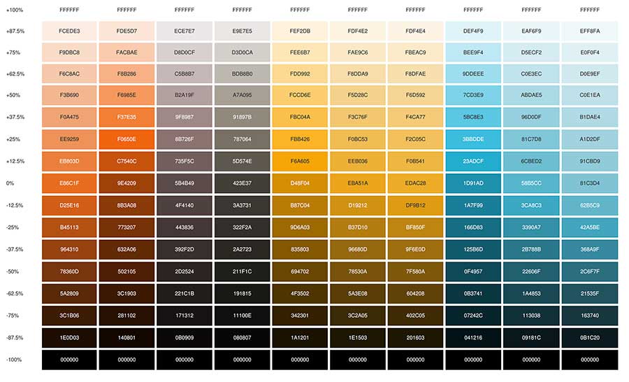
Once I’ve created a color palette, I like to drop it into Coolors to share with clients so they can bookmark. That way they can understand how many different ways their color palette can be used. In other words, my yellow can go lighter or darker depending on my needs. Coolors has a tints and shades feature that is great for demonstrating this.

Color Palette for Fat Dog Creatives on Coolors.co

Color palettes can also be used to change moods. Changing the combination of colors can move from friendly to assertive if needed, even in my own color palette. I stick largely with yellows and “black olive” on a white background. This combination creates a vibrantly enthusiastic, creative, friendly, yet grounded mood.

Should the subject matter and tone require it, I can easily transition into a more assertive (I am the alpha dog) mood by using “black olive” as my background with the oranges and a yellow. Yellows and oranges are close to one another on the color spectrum, which means there will be some tension between them. They’re also closer to red than the blues, so these two close-to-red colors will evoke more assertion and fiery moods.

Tints and Shades of Fat Dog Creatives’ color palette on Coolors.co

Now, you see I have a significantly larger palette than the primary palette of my logo, which consists of only three colors: black olive, marigold, and middle blue. I have a second palette of ten colors and a third palette that expands those ten. All help to keep me on brand but have a broad range of moods and uses.

4. Design Toolbox

Not all branding professionals include a design toolbox, but you should ask for one or at least for feedback on one you create. In this virtual toolbox should be patterns and graphics to help reinforce your brand message and standards.

For example, you know my logo is the backside of a dog. I have other dogs in my design toolbox I can use. I have assigned duties to these dogs, like the mutt representing branding, the Golden Retriever representing web design, etc. I also have a polka dot pattern I use sparingly. Others have scrolling lines, brush strokes, tire tracks, etc. Whatever expands their brand imagery without conflicting with their brand message and ideals.

For Bridget Willard, I created a number of brand assets for her design toolbox. She had fun, paisley shapes with her brand colors, a few brush strokes, and excellent stock photos that represented her brand well.

What Your Slide Deck Should Look Like?

Bridget Willard’s presentation on Backward Compatibility is a great example of what a branded slide deck should look like. Not only does her logo not appear on every slide, it’s only on the first and last. She used other elements in her design toolbox at the time to reinforce and convey her very happy, creative, and bold brand. It corresponded to her website (circa 2019-2020), which is featured below.

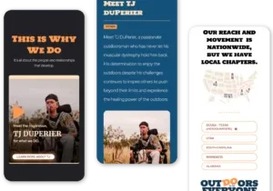
website mockup for Bridget Willard
BridgetWillard.com website design circa 2019-2020

Time to Brand Your Slide Deck

We can get into more slide deck tips in another blog post. For tips on delivering a great presentation, I highly recommend Bridget Willard’s Speaking and Podcasting Tips playlist on YouTube.

Don’t distract your audience with too much on your slides. You don’t want to dilute the brand awareness — effectiveness — of your logo either. Instead, remind your audience at the end of the presentation how to contact you. This way, as the alpha dog, you lead the pack where you want to go — your call to action.

2 Comments

  1. […] “So, is your logo your brand? This is a great question (and likely another blog post). Branding is bigger than your logo. So, yes, your logo is part of your brand. But, it isn’t the only way your brand is expressed.”  Rhonda Negard […]


  2. […] “So, is your logo your brand? This is a great question (and likely another blog post). Branding is bigger than your logo. So, yes, your logo is part of your brand. But, it isn’t the only way your brand is expressed.”  Rhonda Negard […]


Leave a Comment

You must be logged in to post a comment.