Bradley Scott Commercial Real Estate
Share this article.
Bradley Scott, an established commercial real estate business for forty years, rebrands to reflect their attributes, history, and mission to resonate more with their client base and new generation.
When I started working with the owner on the brand’s attributes, I was pleasantly surprised that she had a wealth of information she had already done herself on the culture of the office. The brand attributes workshop went smoothly and quickly because she already had a great understanding of that. The bulk of that work that took a bit more time was related to the customer side.
It’s not about the business; it’s about who the business serves… the customer.
Customer (client) experience: it’s not new to this decade, but it’s certainly become the most defining aspect of branding and success in this decade. Because technology has opened access for more customers to shop more businesses for the products and services they need. Yes, it’s a very competitive landscape for 99.9% of businesses!
Within the last decade or more, this tribal culture in which we are now fully engulfed means that customers no longer just want a particular product or service and/or price shop. Nowadays, customers are looking to belong. they want to be part of something special, unique, and “cause-worthy” that they can proudly stand behind. Look at the incredible rise of organic food brands. Customers no longer want tomatoes. They want produce that wont harm their bodies. It’s not about the taste. It’s about a health movement. Movements are about people. Now, someone buying an organic tomato isn’t just buying to protect their own bodies; they’re buying to protect a generation and the ones that follow. As one, it’s nothing. As many, it’s a movement and each person is part of it.
The Bradly Scott Commercial Real Estate team understands this. If you’re in their market, you might want to pay attention to what they’re doing.
Key Brand Attributes
As a long-standing, successful business, it’s important to convey reliability, stability, and confidence as these attributes are inherent in the brand and valued by its clients.
- Culture: Compassionate, community-focused
- Customers: Understand the value of investments
- Voice: Compassionate, patient
- Feeling: Confident, supported
- Overall Impact: Local economic growth
These attributes lay the foundation for all branded work; visual, verbal, written, etc.
The Mark
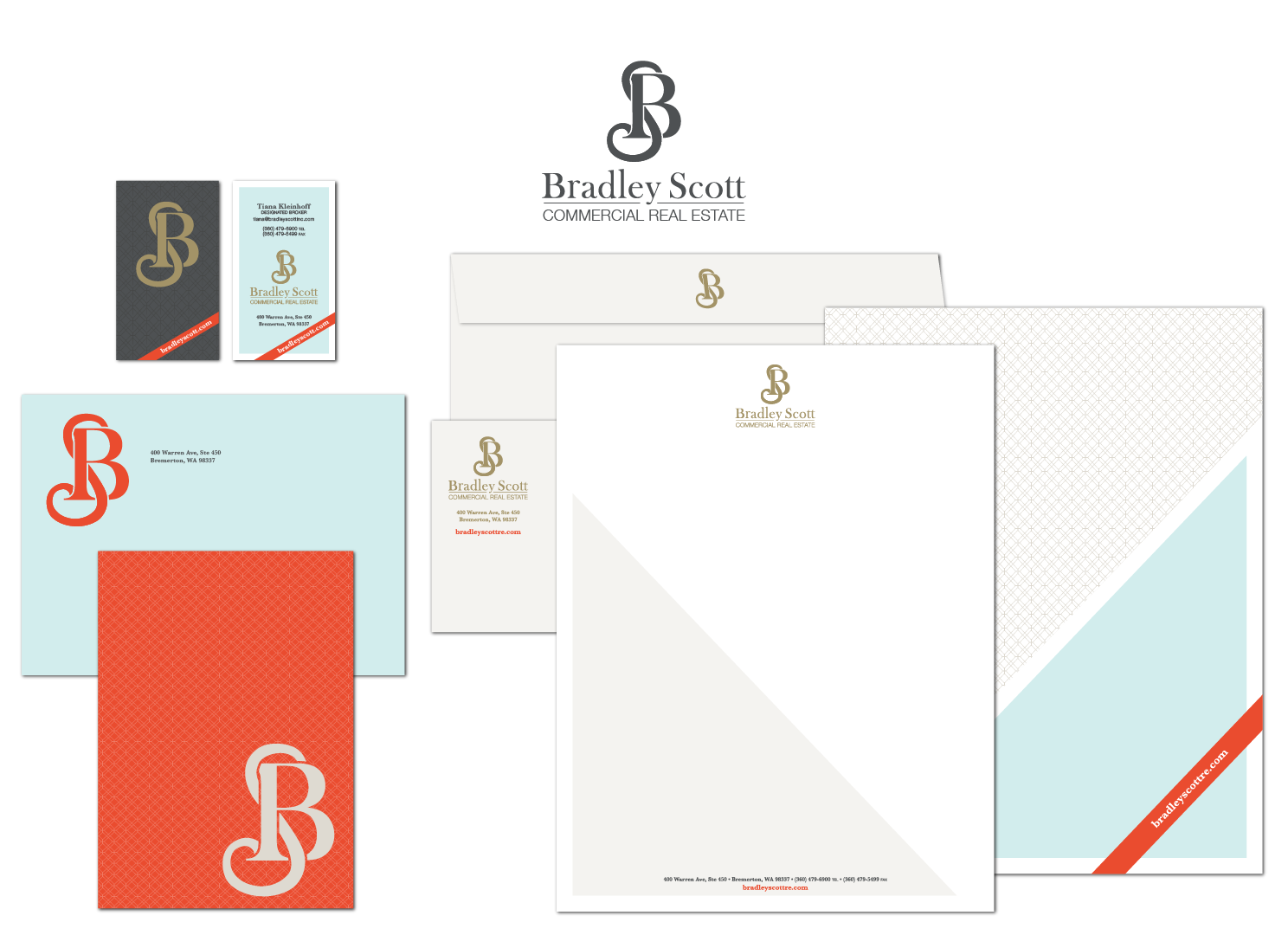
Monograms and crests filled my initial concepting work. However, much of it felt too old, which creates chronological and emotional distance. This contradicts the compassionate attribute.
The monogram concept posed a particularly odd and difficult problem to overcome–the initials. Bradley Scott–B.S.
How on earth do I make a monogram with those letters without it reading BS?
The deeper struggle was honoring both initials with equal visual weight, as well as the sequence. Intertwining them could achieve both!
To achieve equal visual weight, the S is slightly taller but thinner than the B. The B sits firmly and boldly in its place. Because the B is stationary and bold, the lighter S appears to move a bit, which helps to imply its sequence after the B. This intertwining of two letter forms in traditional typefaces creates a mark that is strong, unique, and classic.
The Typography
The logo mark is based on the typeface Baskerville. Such a traditional typeface in other situations might call for another traditional typeface for the name. While I did use a traditional typeface, it is a traditional transitional typeface–Helvetica.
With such a classic mark, Helvetica would be the ideal typeface to bridge that mark with a modern approach to customer experience and other more modern aspects of the brands new visuals. The name itself doesn’t need to be “strong”. After all, they are all about their customers. Likewise, the name itself doesn’t need to be “strong” because the strength is in the mark–the mark they make on their customers and the local economy.
The Color Palette
This is where the brand has some fun! It’s a unique color palette, for sure, but it’s also very versatile.

The color palette contains a mix of warm, cool, dark, and bright colors that allow the visuals to adapt seasonally or for mood/context.

My inspiration for the brand style was a mix of Tiffany’s and Restoration Hardware, where traditional and classic gets a modern twist.

Why Rebrand?
For Bradley Scott, the new brand needed to reflect their attributes and resonate with their client base. It was not a major overhaul; meaning, they had the culture and processes down.
At Odds
Business owners are emotionally and financially attached to their business and its products and services. They often admit the business’s visual branding conflicts with their own feelings about their own business. Or, the visuals don’t match how the consumers feel about the business. They don’t represent the business well. They need a rebrand/refresh.
Next Level
The tournament-style designs a business paid $25 to choose among 200 options might work for the starter mom-and-pop business. As the business grows, it outgrows the original designs and branding (if there ever was any). Making that leap from mom-and-pop to the next level means bringing the business’s visual representations and branding strategy to the next level too.
Overhaul
Sometimes, businesses need to restart from scratch. For example, poor employee attitudes may have affected customer service and turned business away as a result. Over time, recovering proves challenging. A business can do a complete overhaul, bringing those former customers back, and even bringing new ones. With counseling, education, a rebirth of enthusiasm, and visual design, the rebranding conversation can begin.
Does you need a brand audit?
Schedule a Discovery Call to see if Fat Dog Creatives is the right fit and if a brand audit is the solution to your concerns.
