Why Sliders Aren’t Doing What You Think: A Good Idea for Your Website?
So few users ever interact with sliders. If "only around 1% of users click on sliders (Erik Runyon)", you've potentially lost a lot of leads or repeat business.

While I’ve complained about sliders (a.k.a. carousels) for more than a decade, there are situations where they are appropriate.
I used to advise web clients that having a slider means limiting the amount of text on each image to the absolute minimum to get the message across and limiting the number of slides to 2 or 3. The more text on a slide, the longer that slide needs to be displayed. The longer the slide is displayed, the greater the likelihood is the user will start scrolling and miss the next slide(s).
Sliders in the “hero section” (the top of part the website you see above the fold (before the scroll)) remains a common practice. Sliders have a place, but this isn’t it, particularly with how sliders are being used.
Slider Controls
I’m a slow reader and always have been. Sliders frustrate me as a user because they usually change too quickly. I hate waiting through the other slides to get back to the one I need to finish. Of course, sometimes site owners are kind enough to include controls for users to click back or ahead. Unless there’s a stop or pause playback, user frustrations will grow if they have to repeatedly click to go back. This assumes the users even bother with the slider (more on that coming up).
Slide Text
Inevitably, someone will insist on more and more content on every slide.
“We need our visitors to know [this] too!”
Do you, or are you just being lazy?
(Oh, I am wincing just typing that line, but it’s a legitimate question.)
Sliders on websites are too frequently use for important information, including urgent news and promotions. Why is this place and use of sliders bad? It’s not working. If you’re using and relying on sliders to highlight important information, they are making you lazy with your content. If users truly must know all of this extra information,…:
- Shouldn’t there be a more thorough and cohesive way to share that content, like in a blog post, news article, email, etc.?
- Shouldn’t all content be evaluated on business goals and prioritized accordingly?
- Isn’t there a more effective way to share promotional or high priority news/updates on the homepage and above the fold (before the scroll)?
Sliders have become the “make everyone happy” solution. I use solution lightly here because it is NOT a solution.
Thijs de Valk, Yoast
That it does. All that valuable, above the fold real estate gets wasted when using a slider. So few users ever interact with sliders. Yet, there they are. If “only around 1% of users click on sliders (Erik Runyon)“, you’ve potentially lost a lot of leads or repeat business. What a drag!
Choosing or defaulting to sliders to compromise is compromising business.
In-depth debate and/or research about goals, urgency, and what users actually want has gone by the wayside in favor of a completely ineffective feature that seems fancy or flashy to the business stakeholders, but it’s annoying and overlooked by the users, who are why the business exists in the first place.
I cannot count how many conference rooms I’ve sat in with stakeholders who care more about their department’s goals than those of the company and far more than those of the people they actually exist to serve, their clients.
Obviously, this is more typical of larger businesses than smaller ones. Solo-preneurs rarely get that particular priority wrong. Still, the sliders persist on business sites from small to big.
Not responsive means unresponsive, DOA!
When a website or module isn’t responsive, it means your site or module is dead. It’s true because a content module not adjusting to varying screen sizes also means it’s not read. It’s bypassed.
- They aren’t very responsive. (This is a concern for sliders with text.)
- They slow down your site, especially if they’re using Flash (yikes!).
- They look like advertisements so people ignore them
- They aren’t good for self-paced reading. (I find it rude when the slide moves before I finish reading, like when movie subtitles move too quickly.)
- They give users too many options, which makes it harder to make a choice
- They lower conversion rates
Example of Appropriate and Inappropriate Use of Sliders
Where Sliders Help: Sliders aren’t out altogether.
It’s not all bad news if you love sliders. For those with portfolios for services like photography and design or for those wanting to feature product variations, sliders are an efficient use of space.
Below is an example of me showcasing the different versions of featured images (for social media sharing) for Bridget Willard’s blog. She has a total of five different colors for five different blog content categories.
- Yellow: Branding & Marketing
- Red: Tech
- Blue: Content Marketing
- Merlot: Business
As a designer showcasing the options, this slider is effective. It’s a great option for portfolios, event photo galleries (limit the slides to less than 1,000, though. Ha!)
For Bridget to use this slider to promote and link to the content each slide references is less effective. It is, however, better than most because the headline is large, easy to read, and less than ten words.
It’s tempting to want to put “motion” or interaction at the top of the page. We have to keep the users in mind, though. If motion is what you want, maybe there’s another option to deploy with less significant content. Your priority is to keep your visitors informed and make visiting your site again desirable and easy.


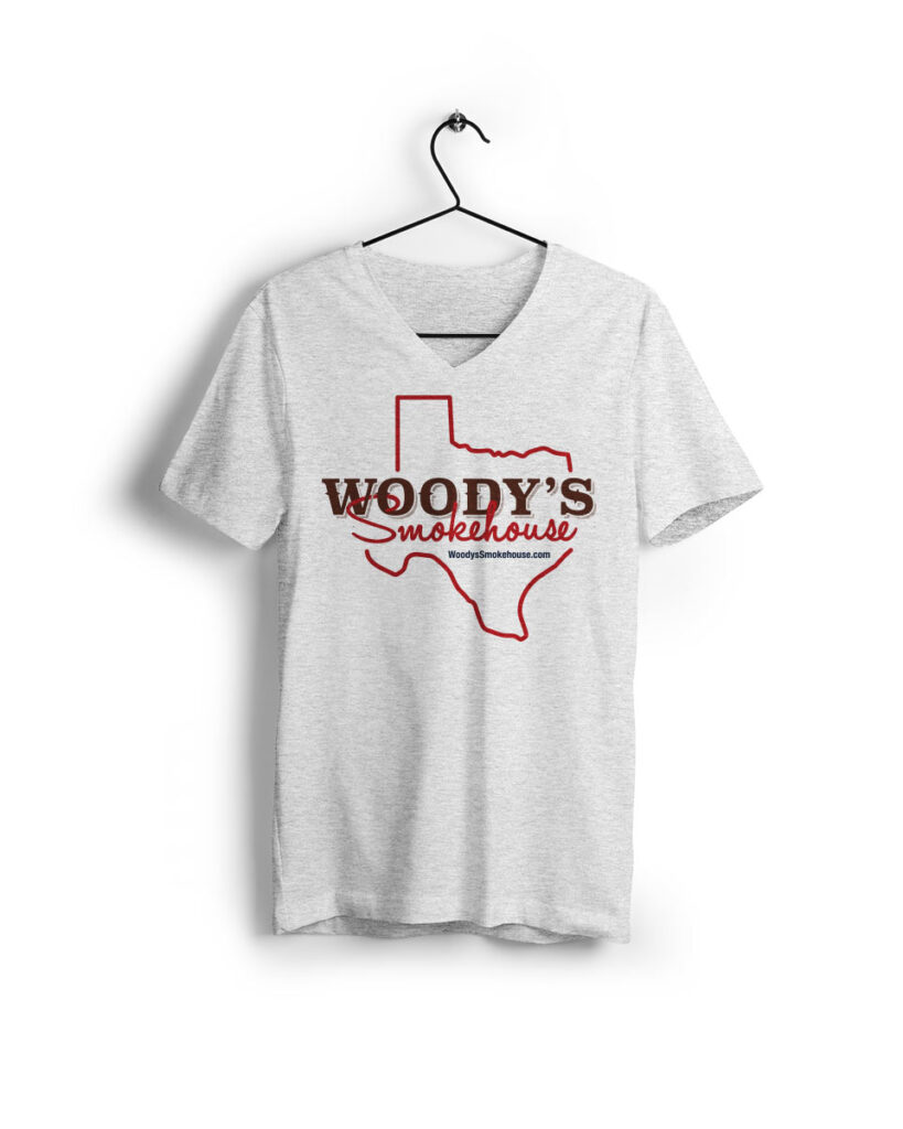
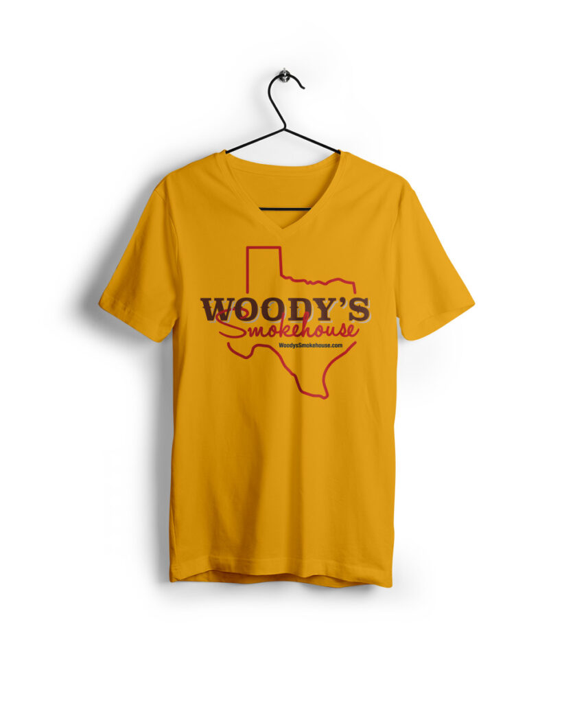
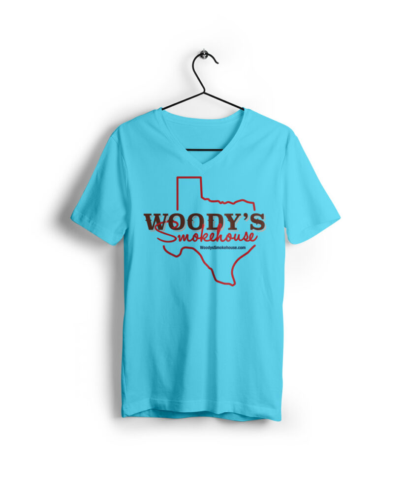
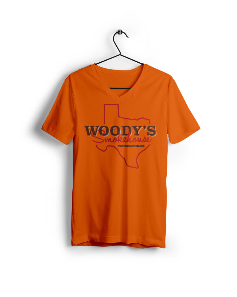
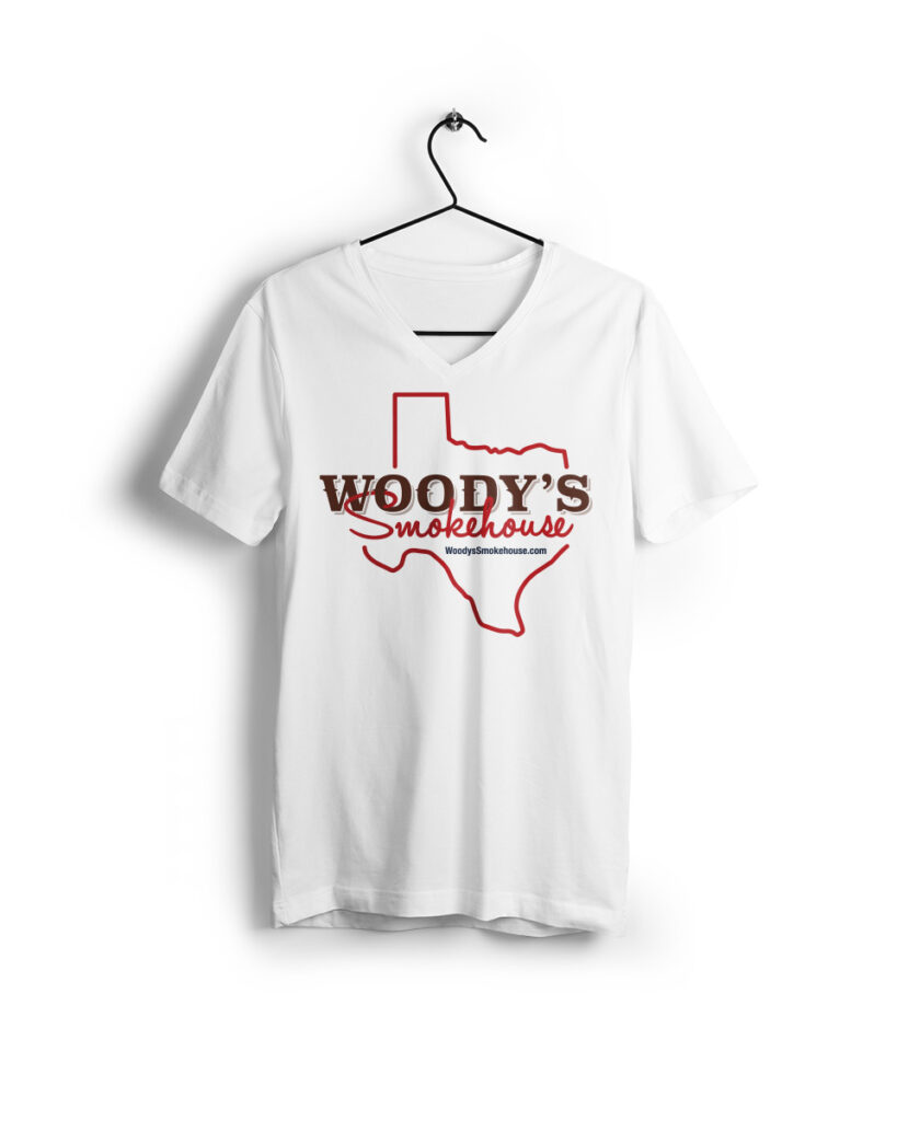
Product Variations: Excellent Use of Sliders
The gray shirt is the main product image, which is typically selected because it’s either the one with the greatest margins for the seller or the most commonly sold color. The sliders feature other shirt color options (known as a product variation).
In summary, use sliders for extras, not high priority content.
- Sliders work well when highlighting event photos, portfolio items, product variation photos, and other secondary information.
- Make sure to have controls for playback, pause, etc. to make it easier for users to refer back to a slide.
- Limit the text: 7 words or less and 5 letters or less per word should be your target. (Although, that’s a goal, it’s often not possible. Having this goal will help you reduce your word count and word sizes, and that’s why you should keep it in mind.)
Bradley Scott Commercial Real Estate
Bradley Scott, an established commercial real estate business for forty years, rebrands to reflect their attributes, history, and mission to resonate more with their client base and new generation.

No Need for New Content
This is exciting news. You do not need to worry about creating new content! Would you prefer to listen instead of reading this blog post?…

Website Redesign Case Study: Bridget Willard
WordPress Website for BridgetWillard.com Read also Bridget’s case study on the need and process for the redesign Before Bridget contacted me, her site looked like…

Where does your Website fit?
Regardless of what your website looks like, what platform you use to manage its content, or where it’s hosted, it shouldn’t be a “one and…

The Disrupters Podcast: Branding and Websites
I recently joined The Disrupters on their great podcast again, Candace Thompson of Wild Child Group and Bill Lee of Keba Agency, to discuss the importance of…